Pulling the cap off Mac’s.
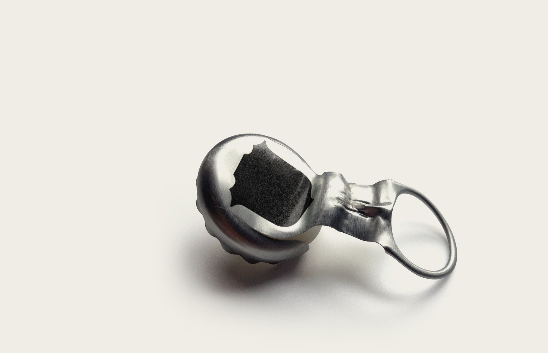
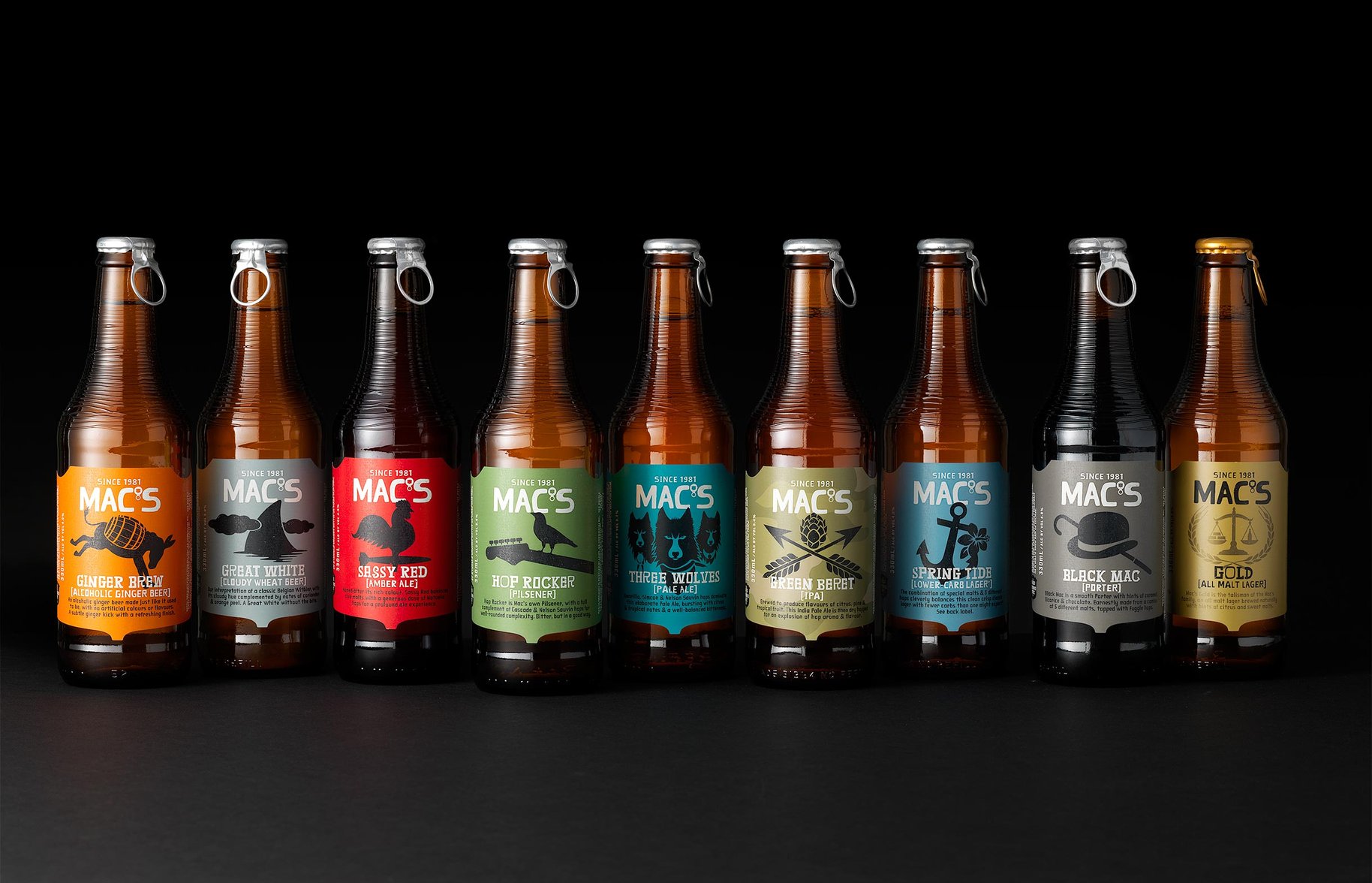
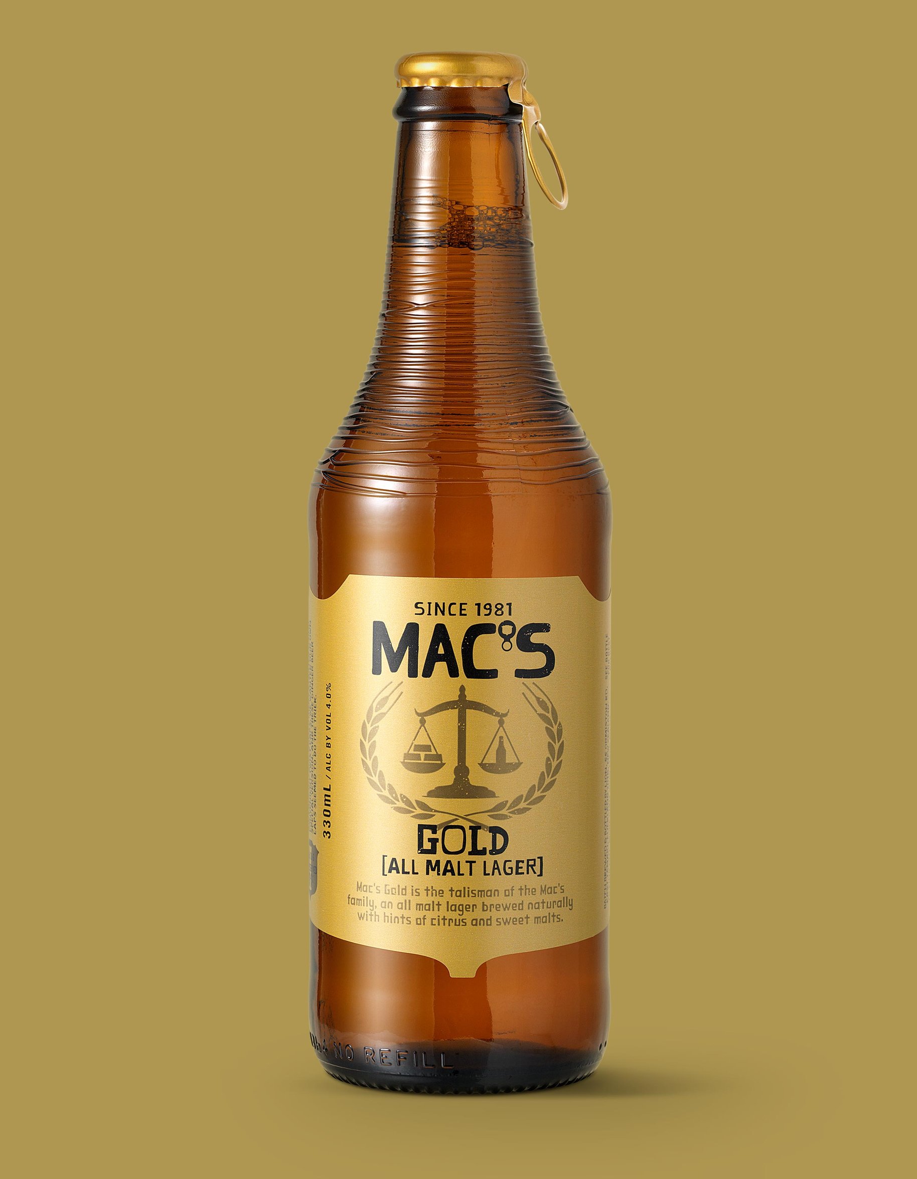
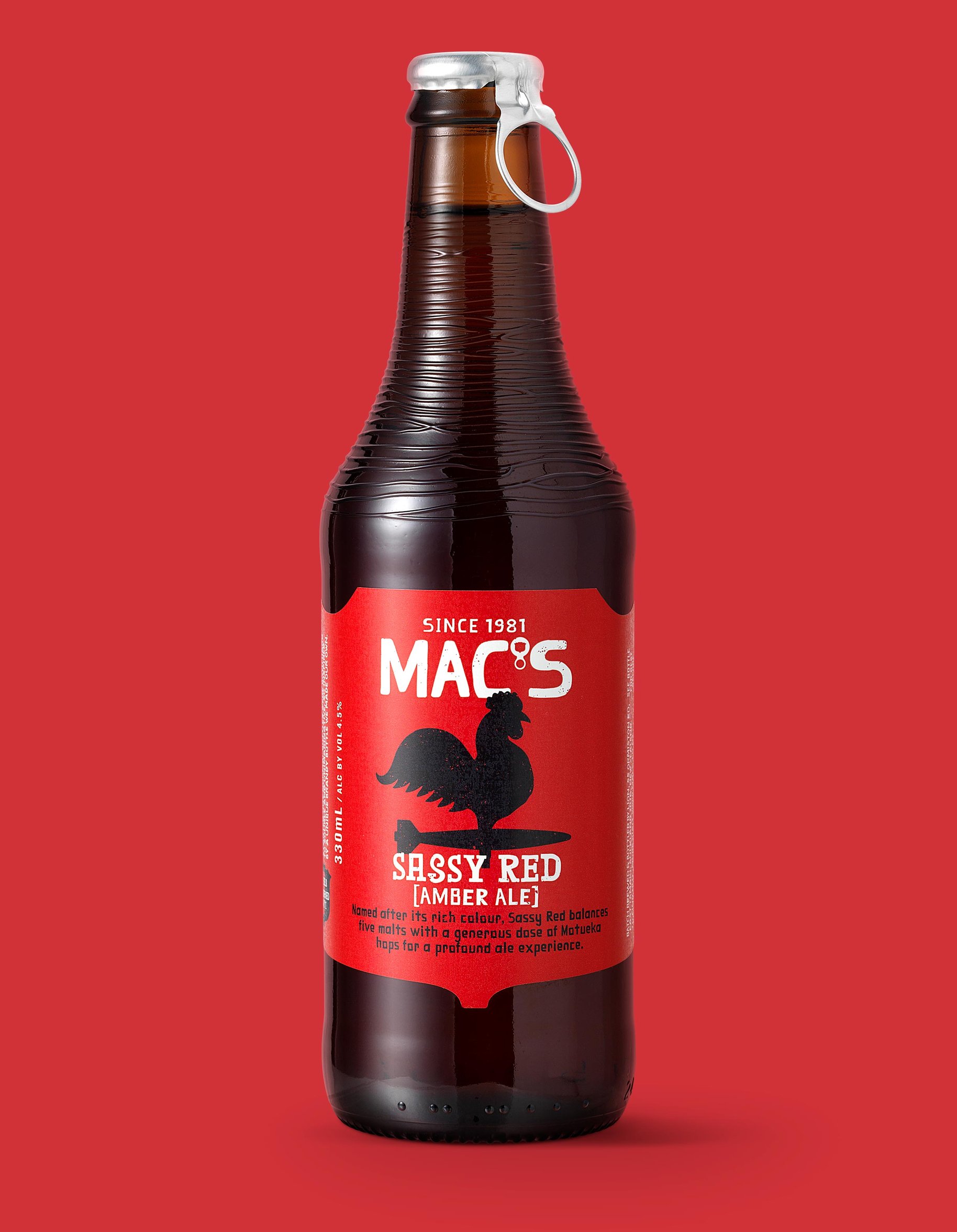
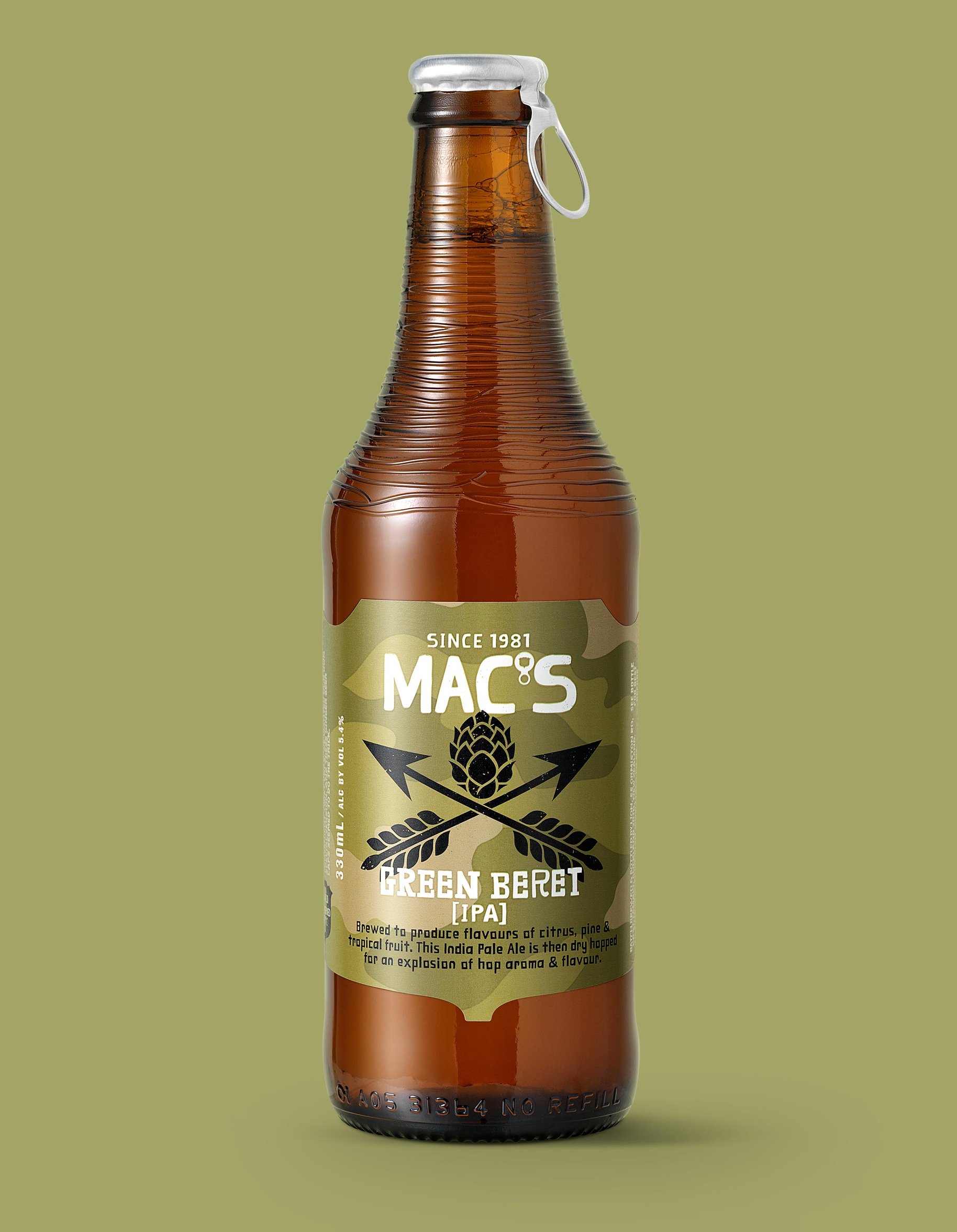
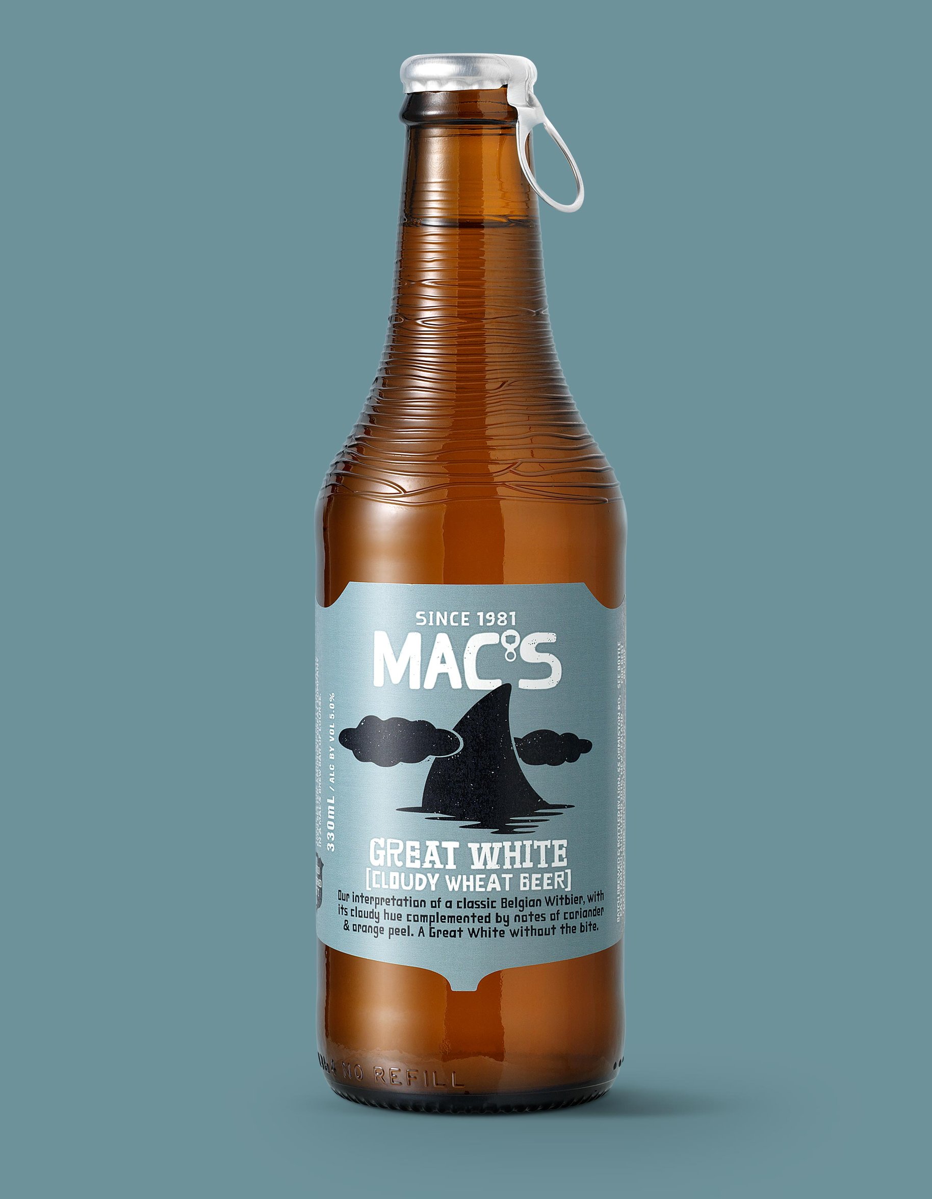
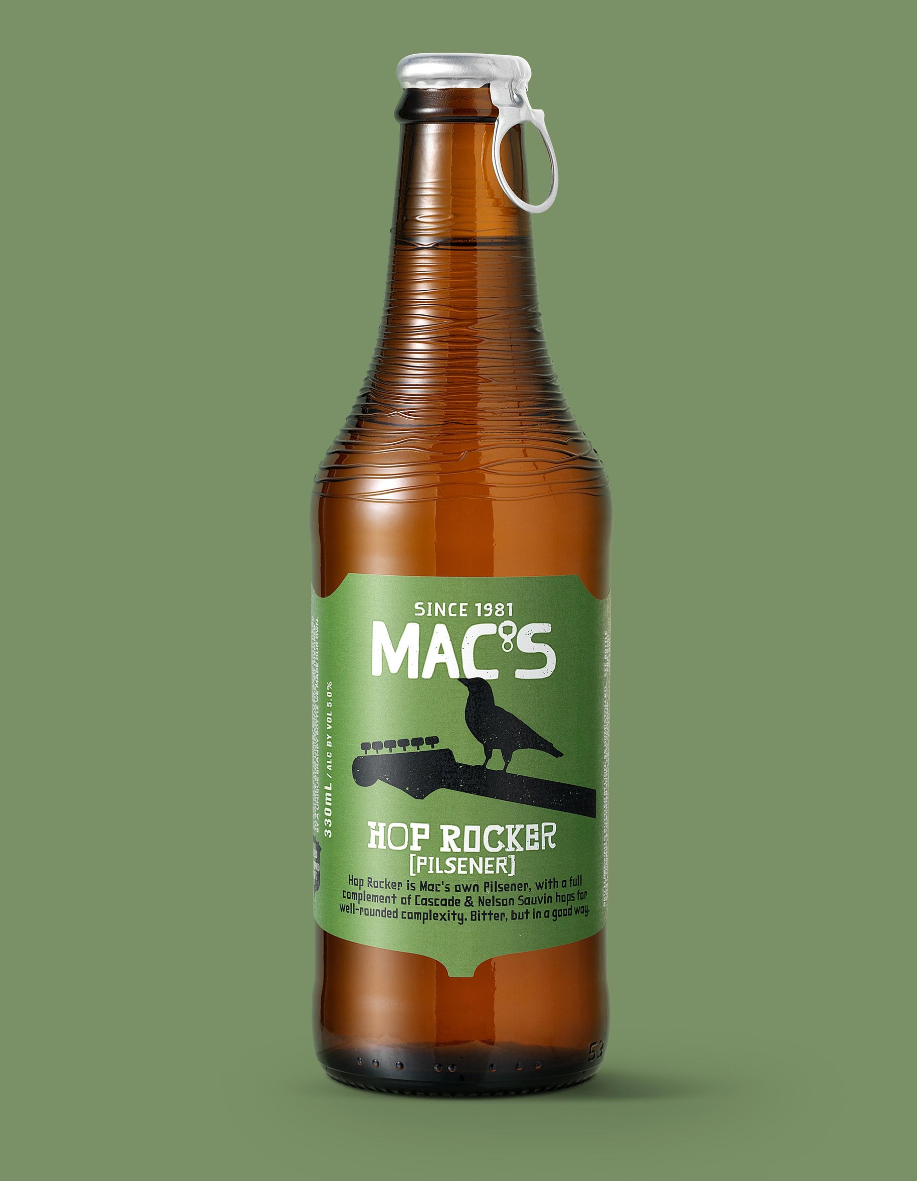
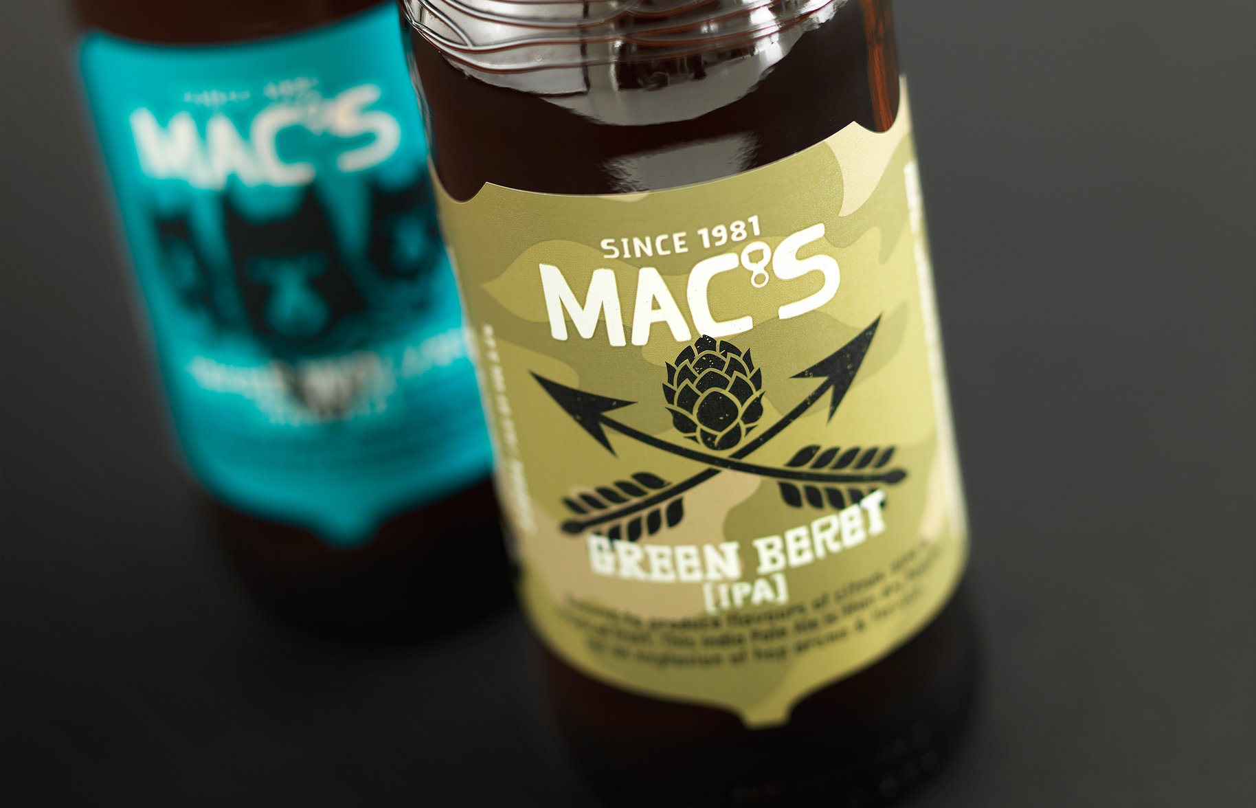
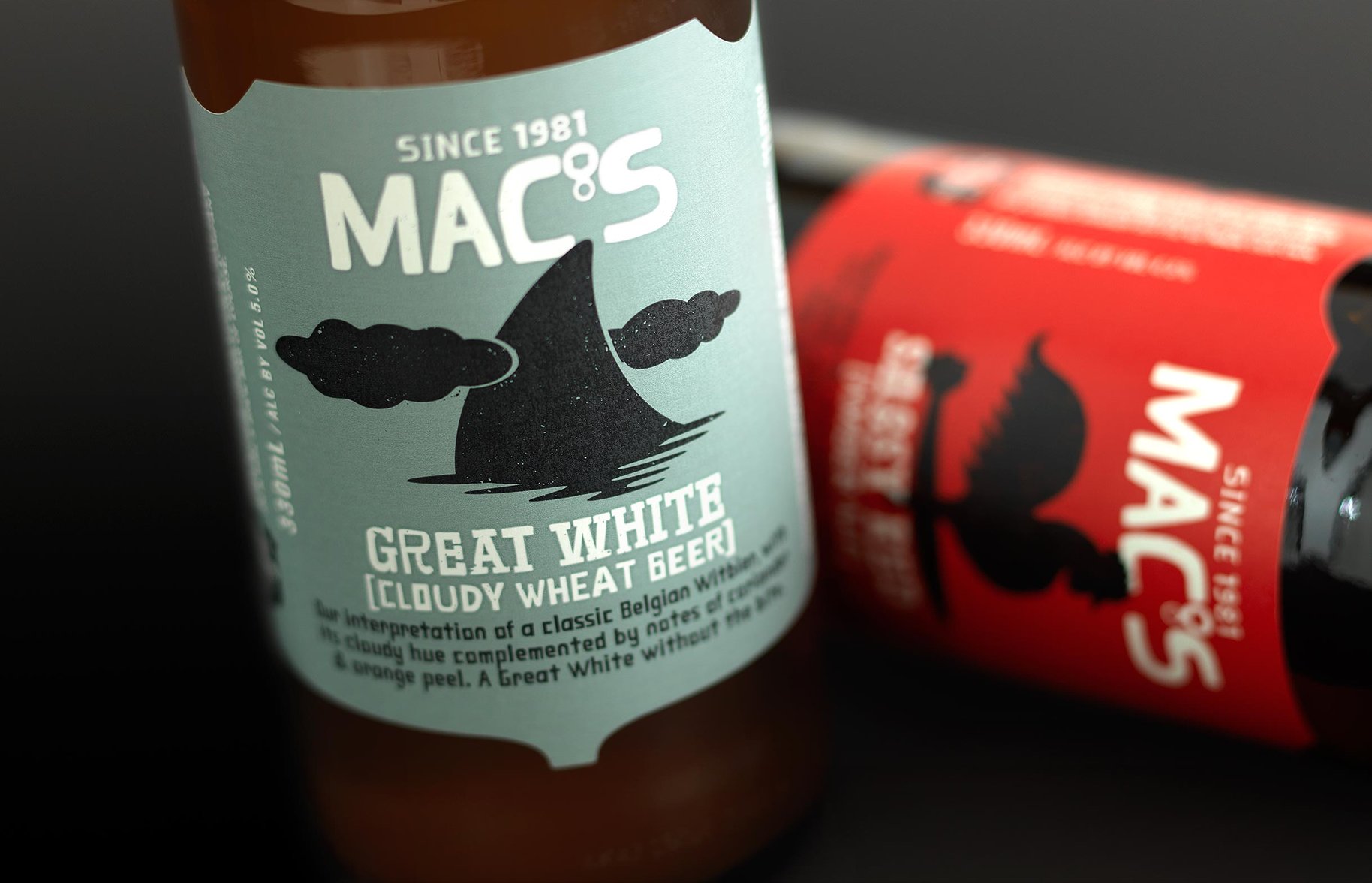
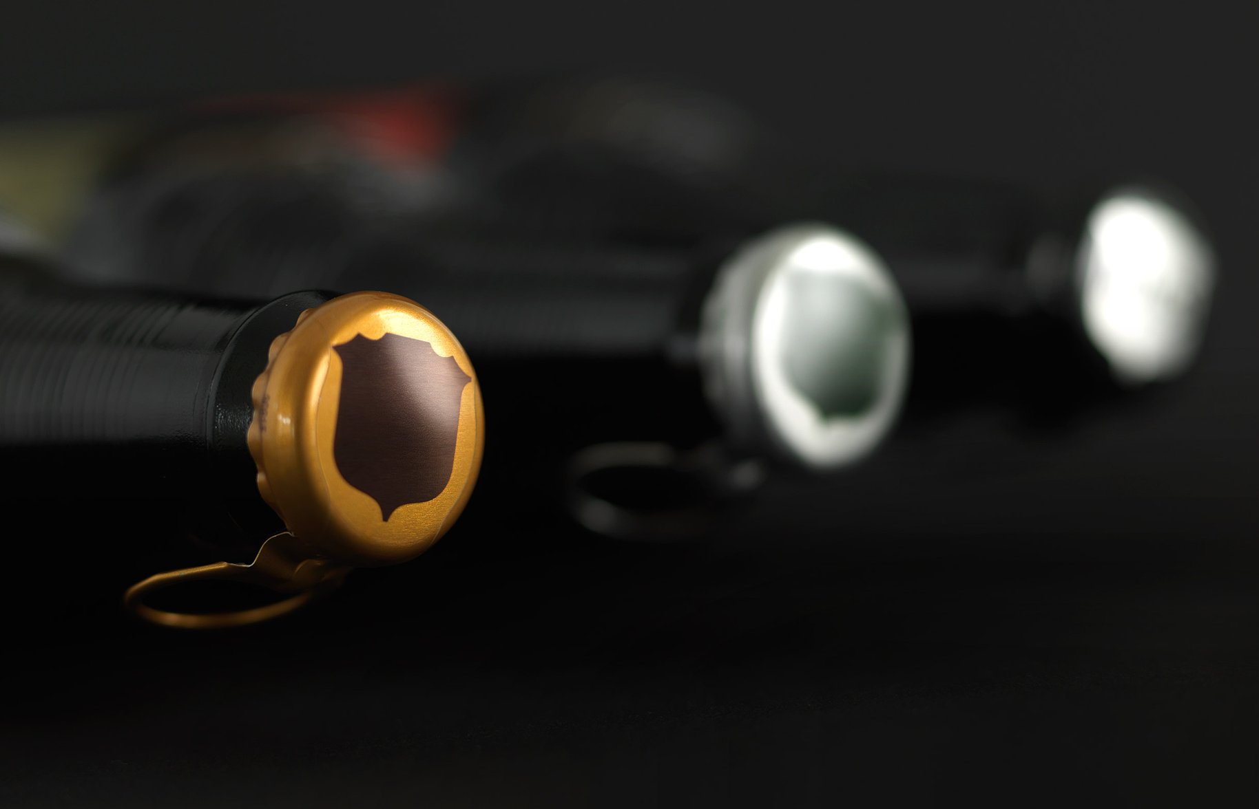
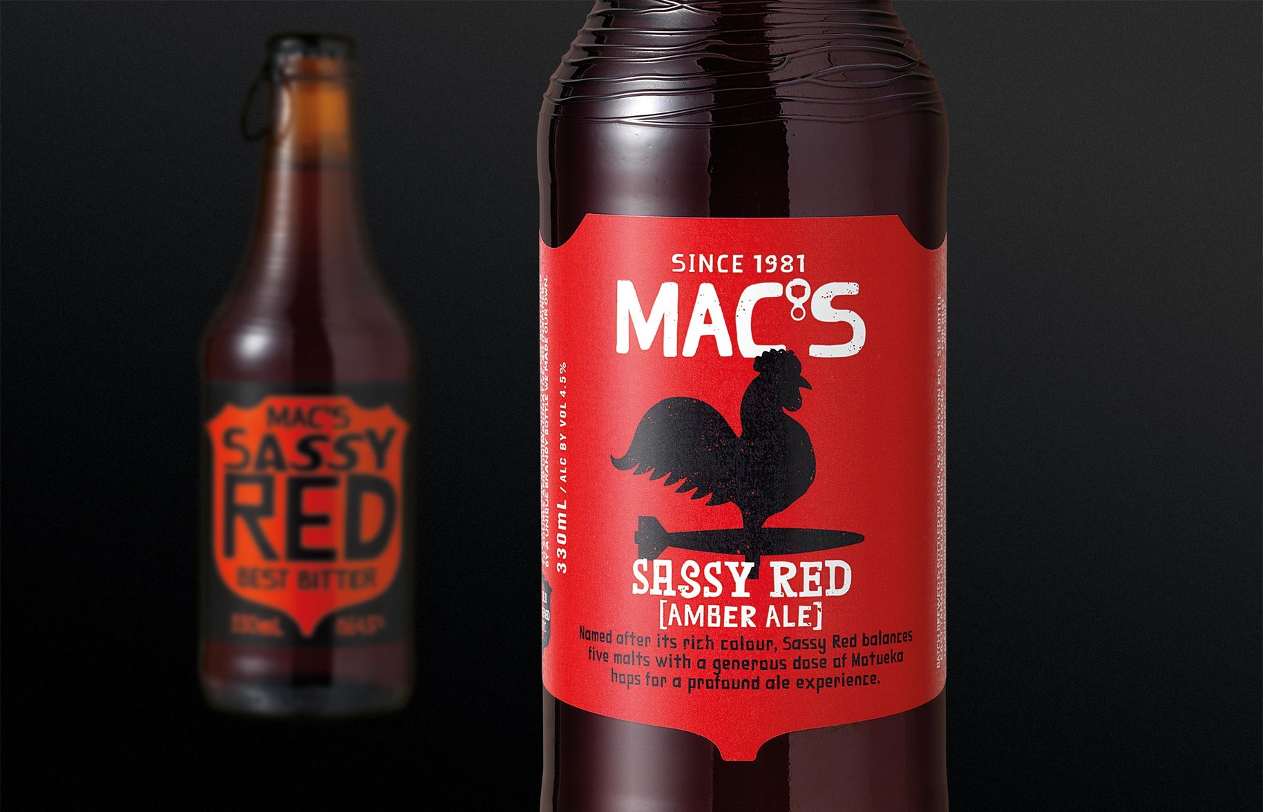
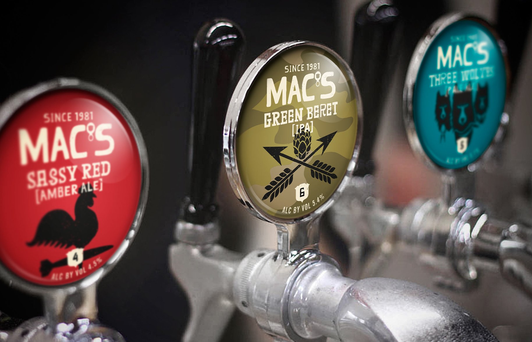
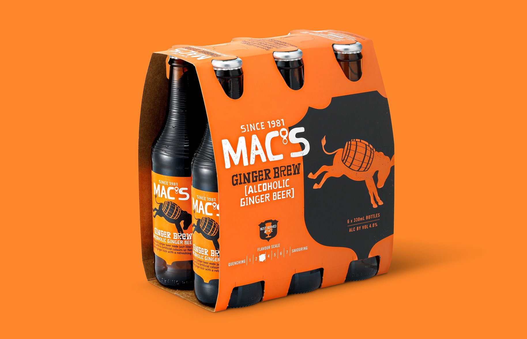
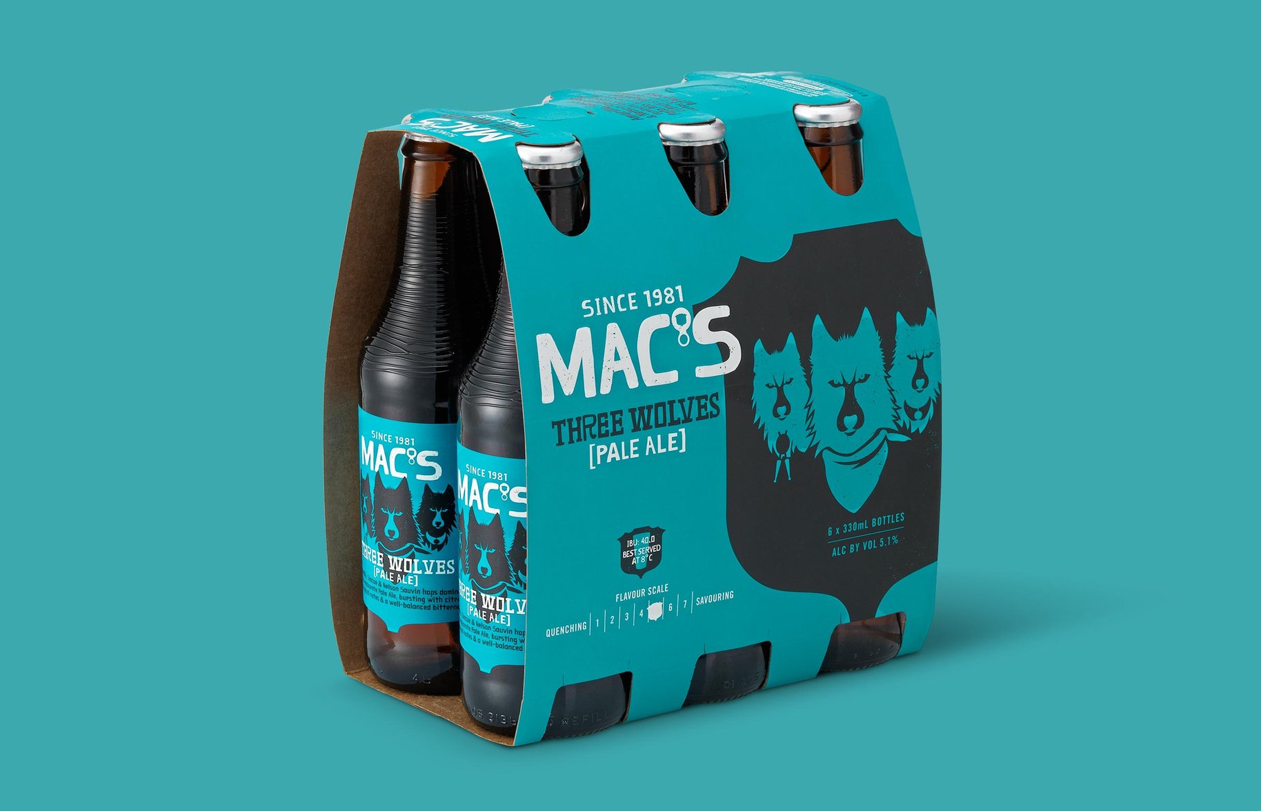
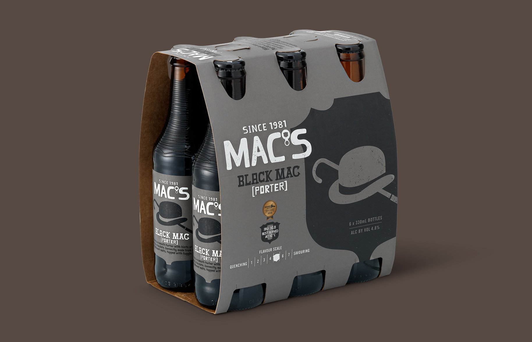
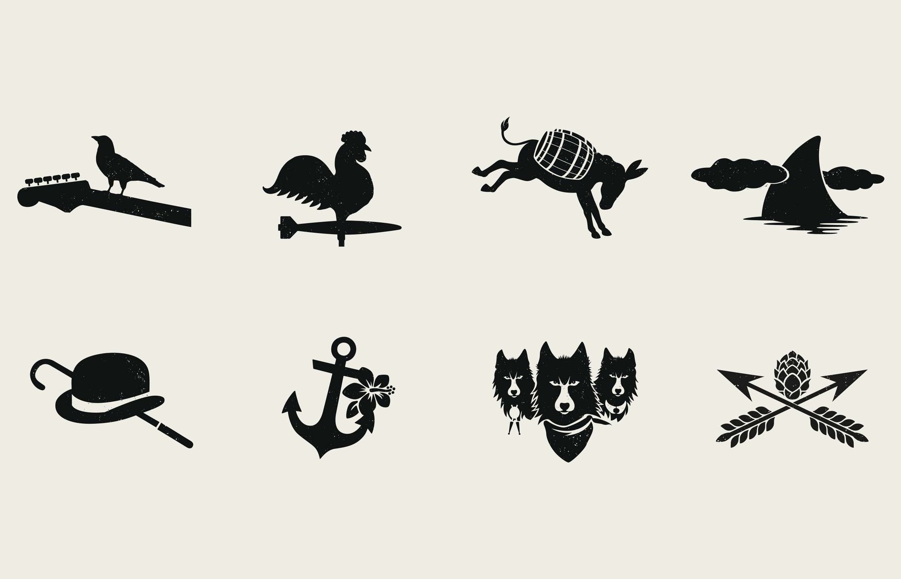
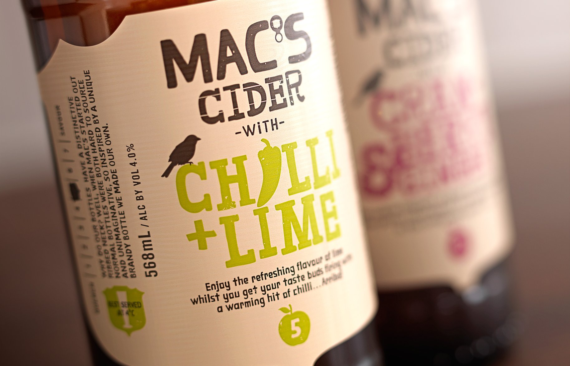
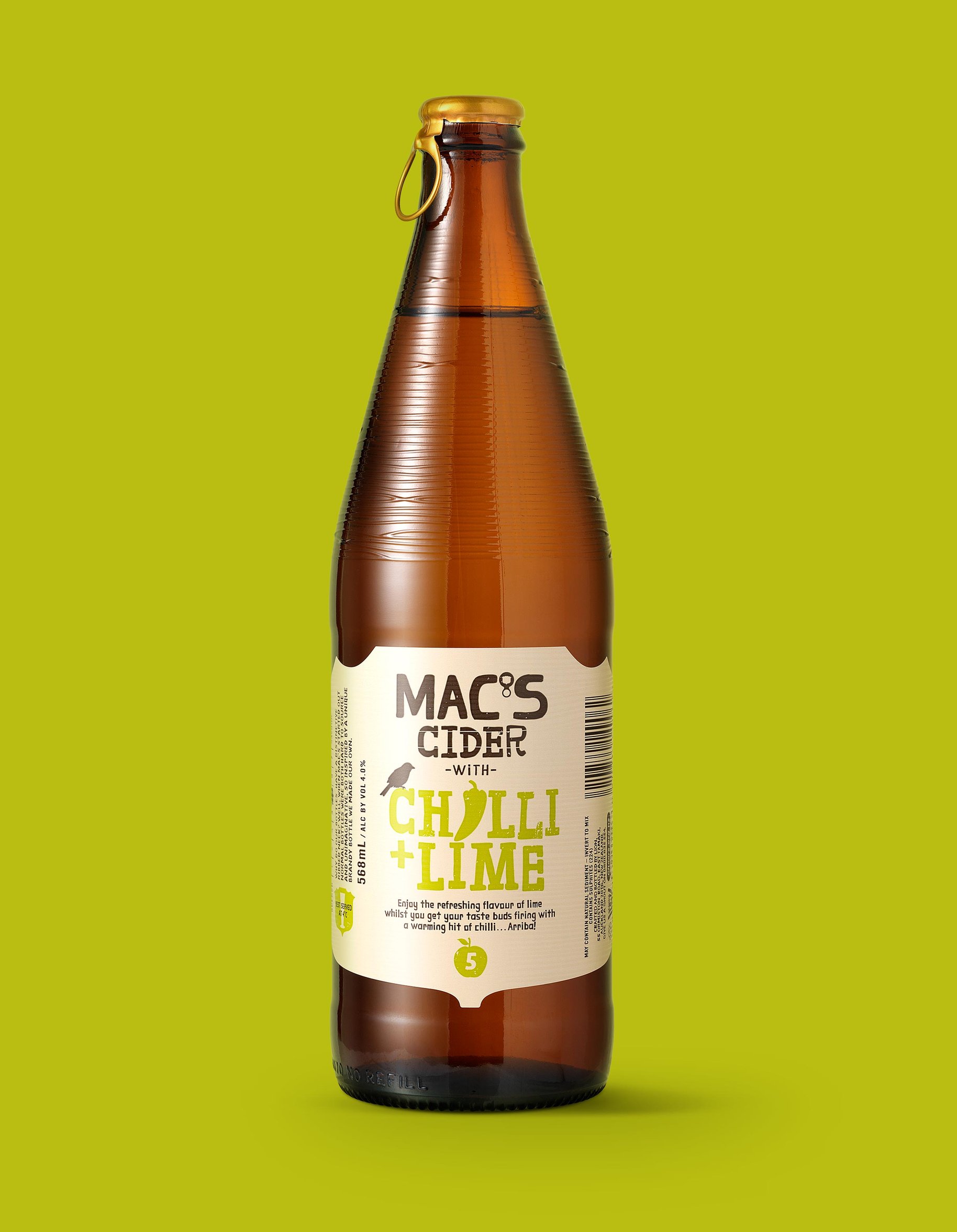
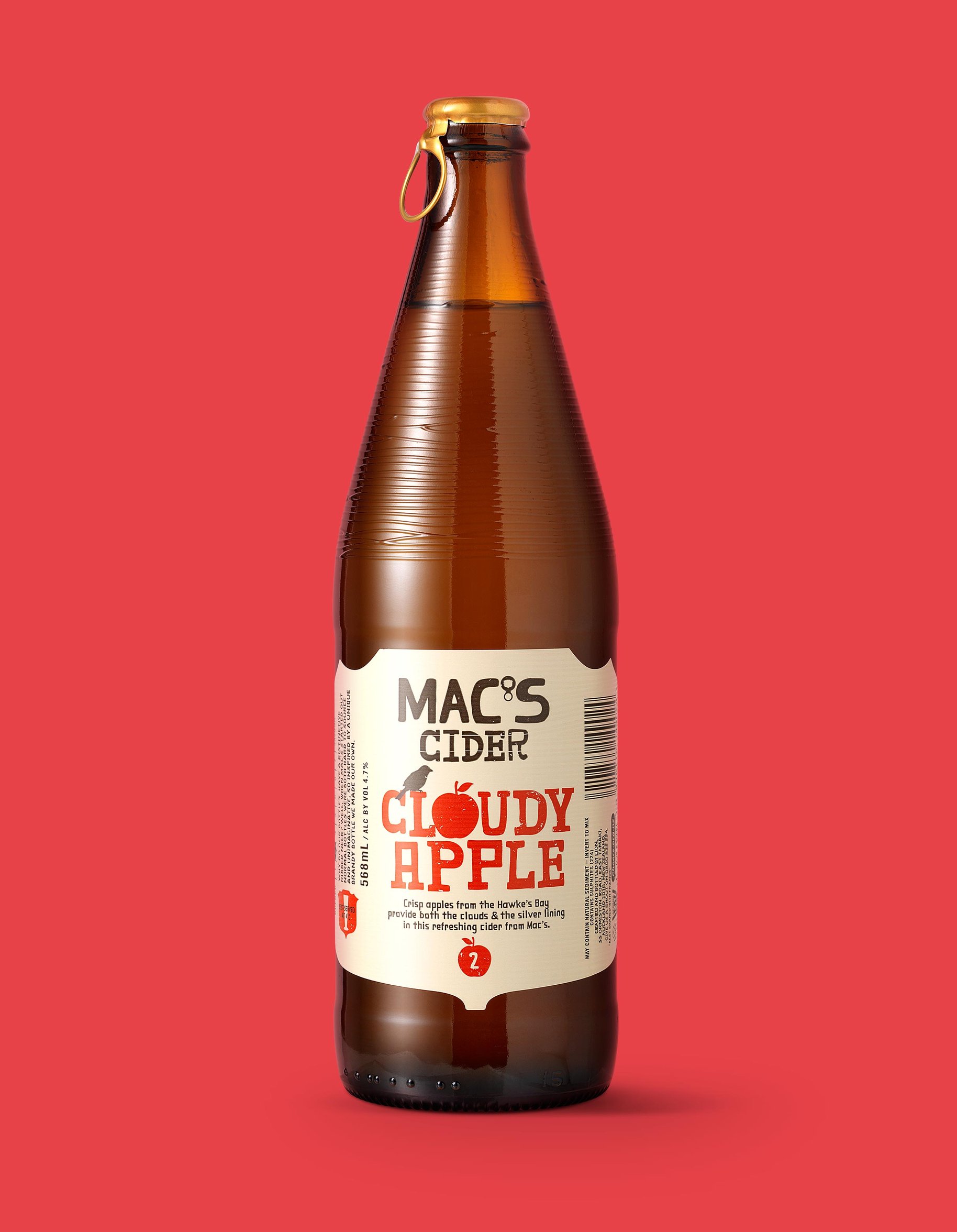
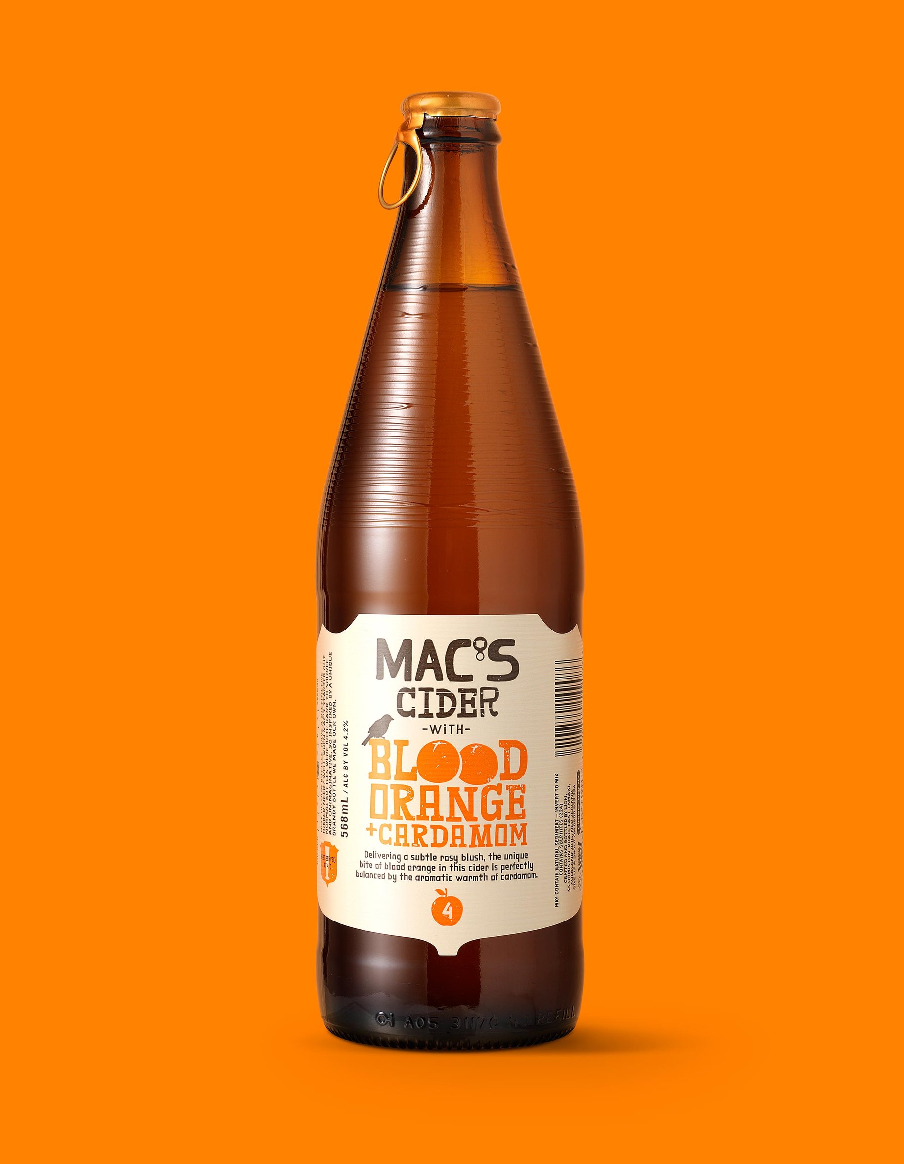
A lot has changed for Mac’s in the beer category since it trail-blazed the birth of craft beer in New Zealand, back in 1981. Despite its rich heritage and independent brewing reputation, Mac’s had recently lost a bit of momentum in a market jostling with bright eyed, bushy tailed new craft beers - a bit galling when Mac’s has continued, quietly making great beer and consistently winning awards. The challenge was to tell the burgeoning ranks of discerning and mindful beer drinkers more about what makes each of Mac’s’ brews so great. And this needed to be true to the experience of enjoying Mac’s, not some made-up marketing schtick. What we’ve injected back into Mac’s is a bit of intrigue – a hat tip to the imagination and creativity that went into making these masterful brews. There are lots of detailed tweaks for the discerning eye - like the incorporation of the iconic pull cap in the name. This has all been a great lesson in understanding sometimes you need to change in order ‘to thine own self be true’.
- •
- •
- •
- •
- •
- •
- •
- •
- •
- •
- •
- •
- •

- •
- •
- •
- •
- •
- •
- •
- •
“The redesign process has been a balancing act. Making the necessary confident changes to better reflect Mac’s true brewing credentials, whilst retaining the core brand elements that have made it such an icon. Dow, through their incredibly detailed and strategic approach, have been mindful of this, and you can see this in all the small, clever details they’ve introduced. I’m expecting beer drinkers are going to enjoy discovering the new heroes just as much as rediscovering the Mac’s classics”
— Dave Pearce, Marketing Manager, Lion