Keeping it Real.
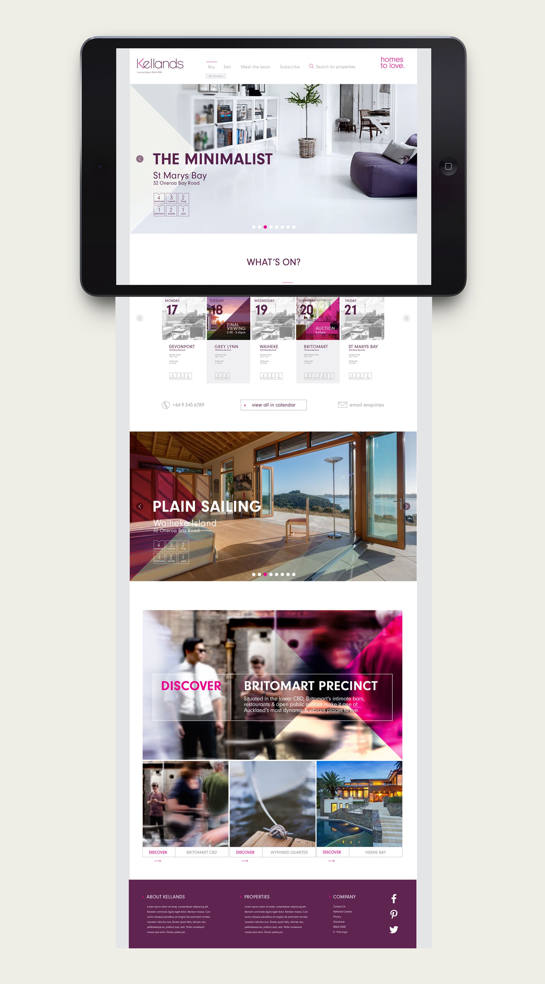
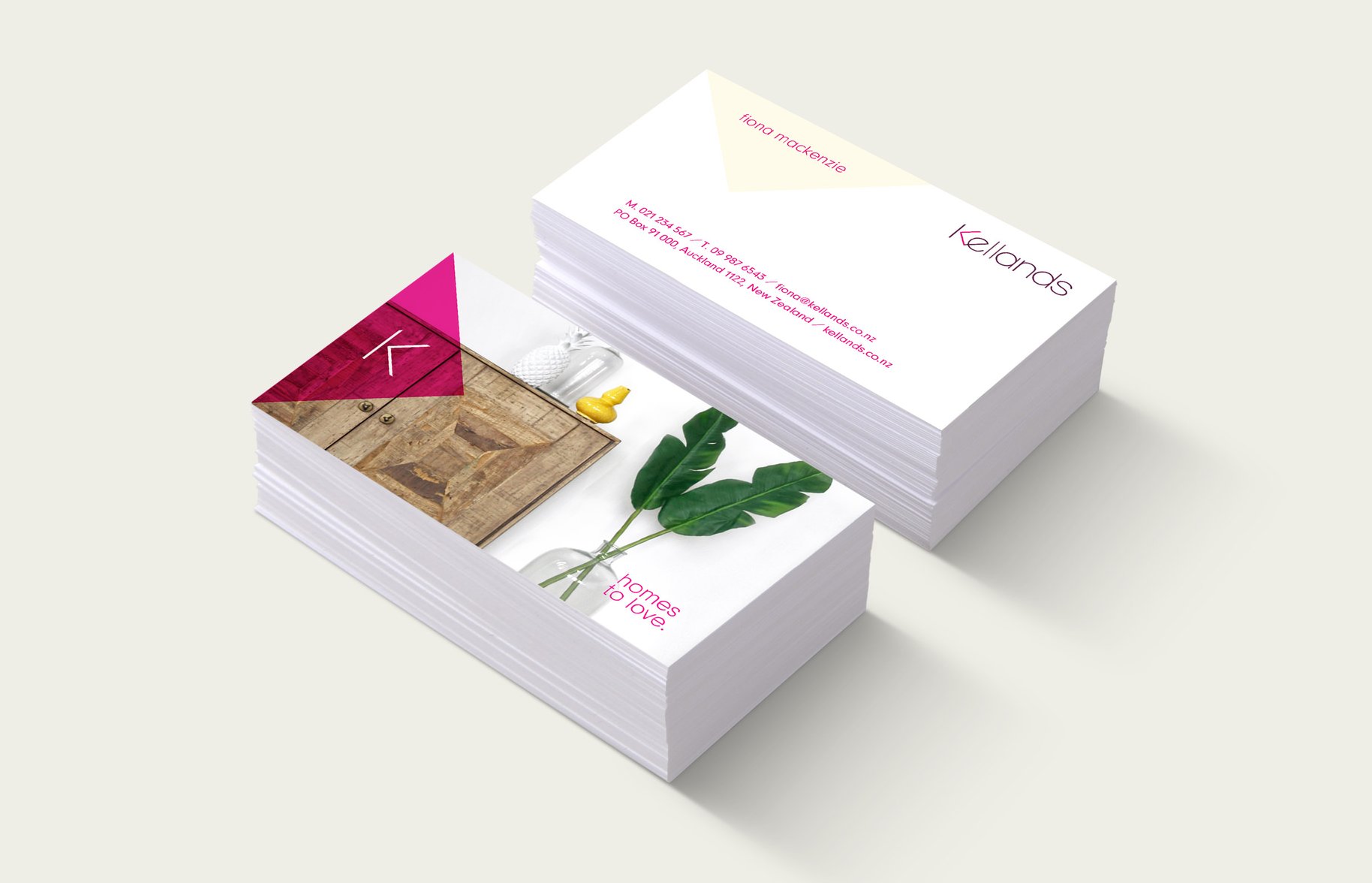
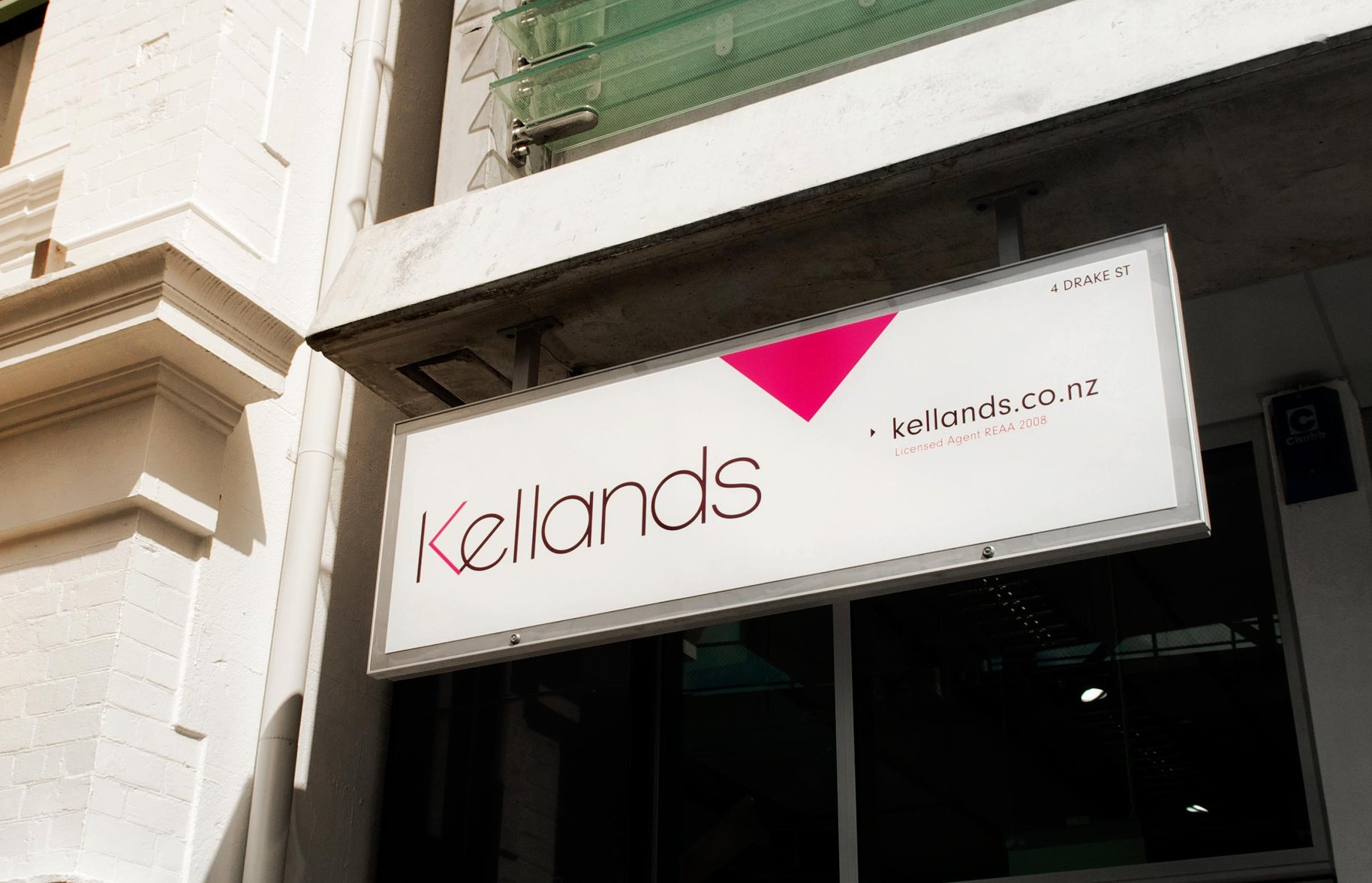
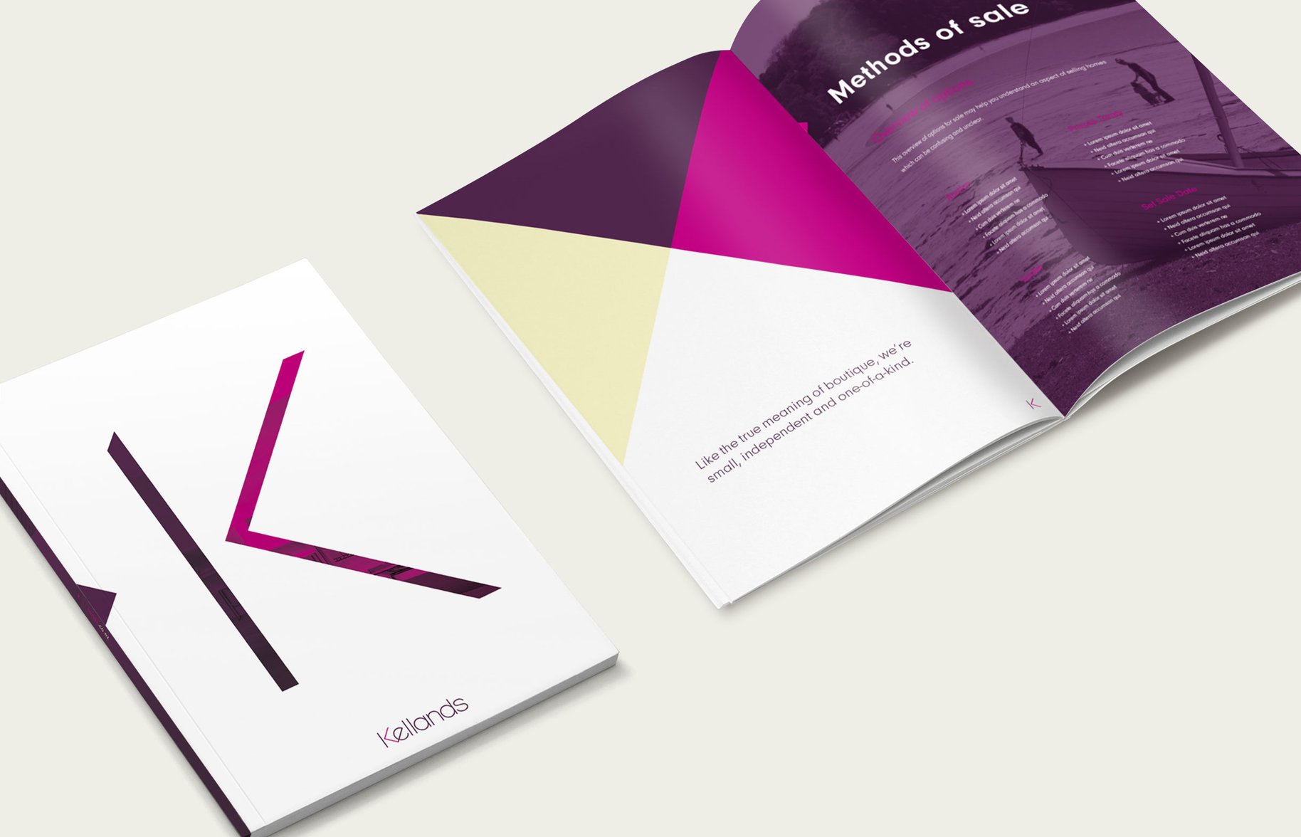
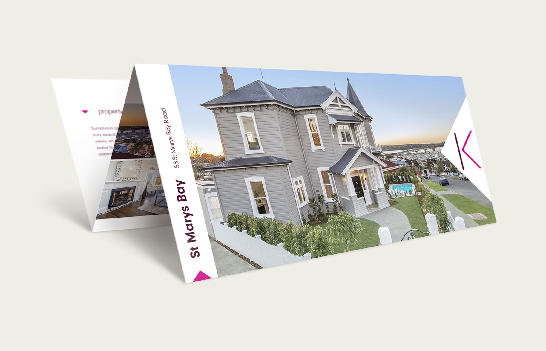
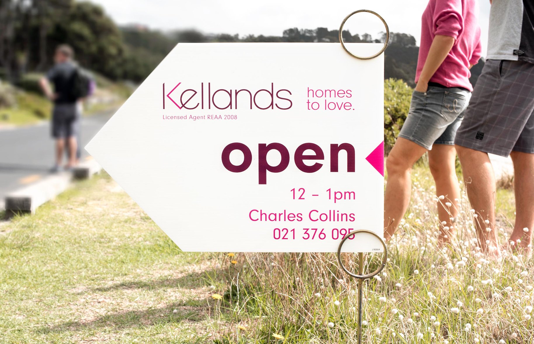
When you see the Kellands flag, you’re treading the path of the well-heeled. But even the hottest homes sometimes need a major renovation – and the same is true for real estate brands. In a city of young and hungry agencies, and old and hungry, Kellands needed to look sharp. Our challenge was to refurbish Kellands from attic to basement, while keeping some of its original features. Like the distinctly non-real estate colour palette. We updated the logo to link past and future, introducing stylish geometrics, and a more pared back palette. More high-end fashion. Less high-sales real estate, ironically. Because it’s the voice that is as much about design as selling that speaks to the hip, new school of discerning buyers and sellers. And this fit rather well with our new strapline ‘Homes to love’.
- •
- •

- •
- •