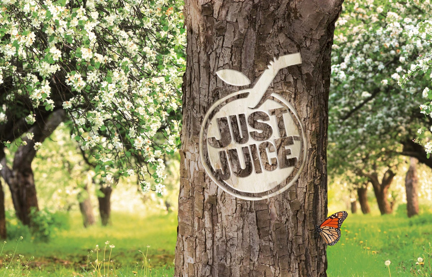
Just the truth.
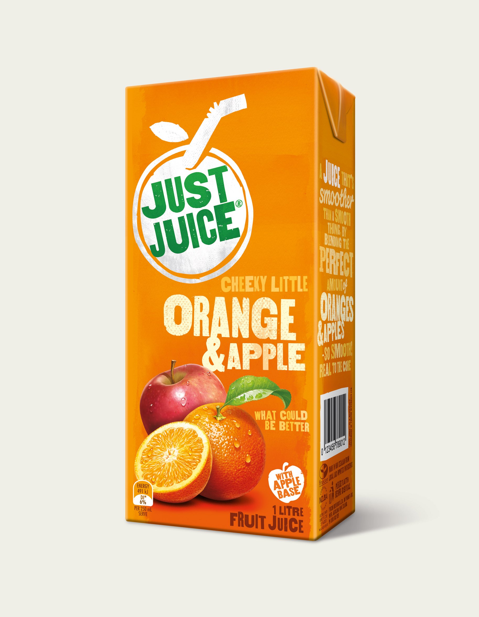
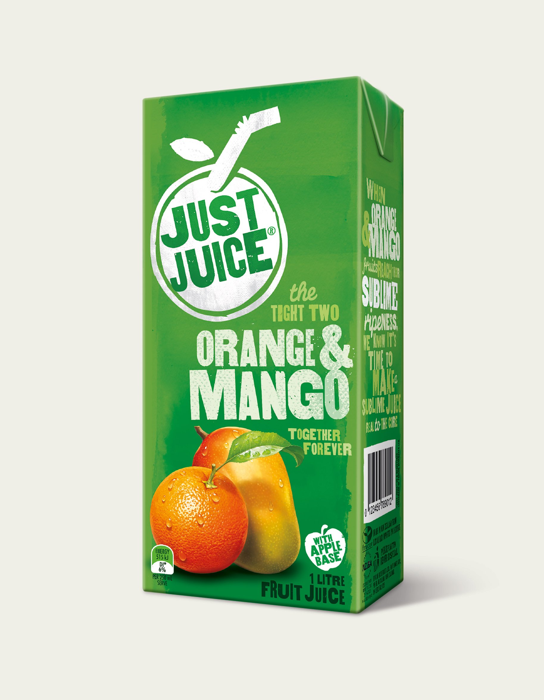
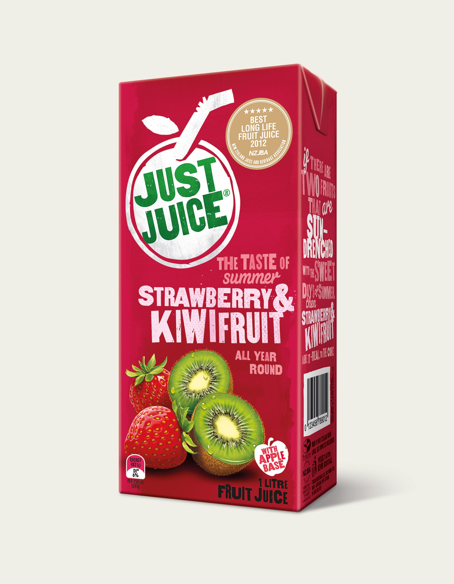
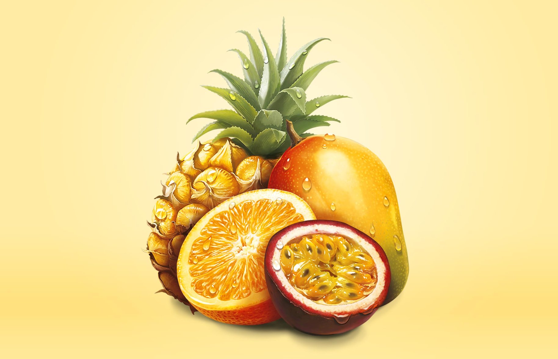
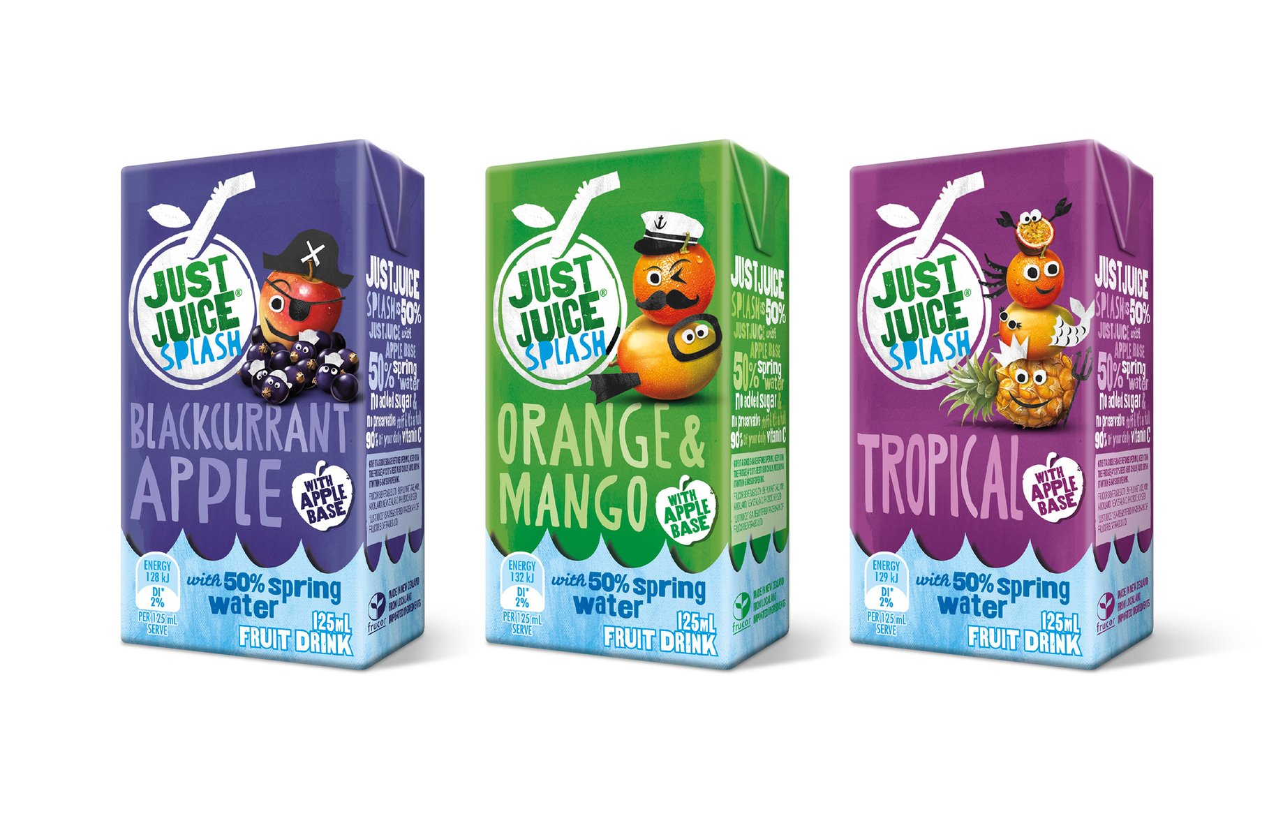
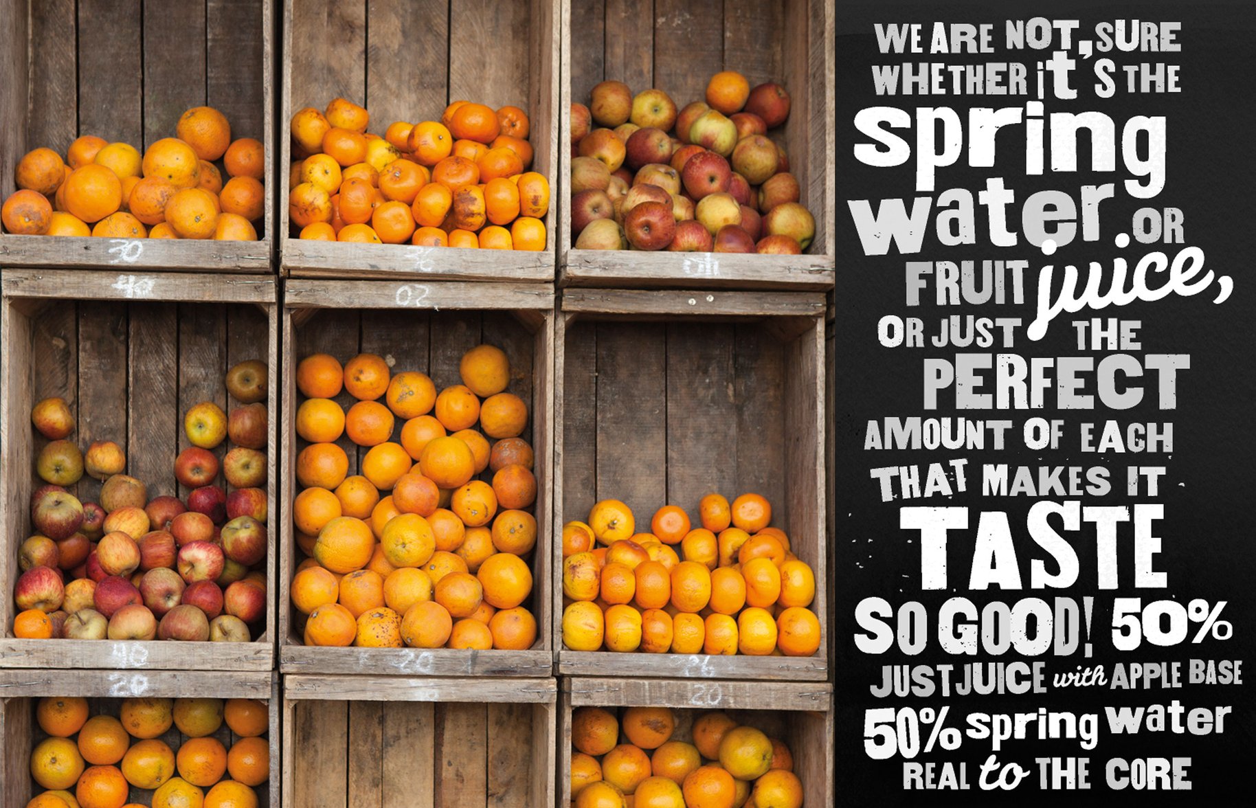
Just Juice needed cohesion across its more than 50 different products. Which threw up a bit of a challenge. How to grow love for a colourful, fun brand that produced some of the best-loved and trusted products in supermarkets. Oh, and do it without losing loyal supporters. Not that Just Juice had been resting on its laurels. There was also an innovative range containing 50% less sugar that needed to be considered in the mix. So, we got back to basics. Just Juice had always been known for tropical family fun. But the story had become too elaborate and shifted away from the simple truth. We developed a straightforward design system that highlights its real fruit and therefore its quality. This enabled Just Juice to hold its price and profit. We love it when we help our clients do that.
- •
- •
- •
“Dow Design have combined creativity and insight to deliver a design solution that worked seamlessly and effectively to communicating the Just Juice brand to the shopper at the moment of truth – the shelf. As a result we have seen real improvements in our brand health and great profit growth”
— Nicole Scown, Senior Brand Manager Just Juice.