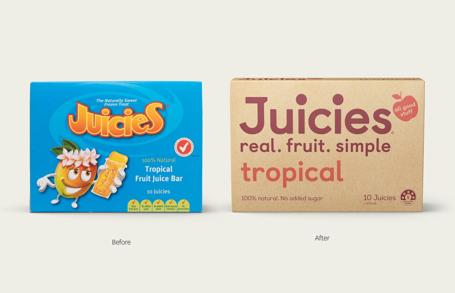
Wabi sabi.
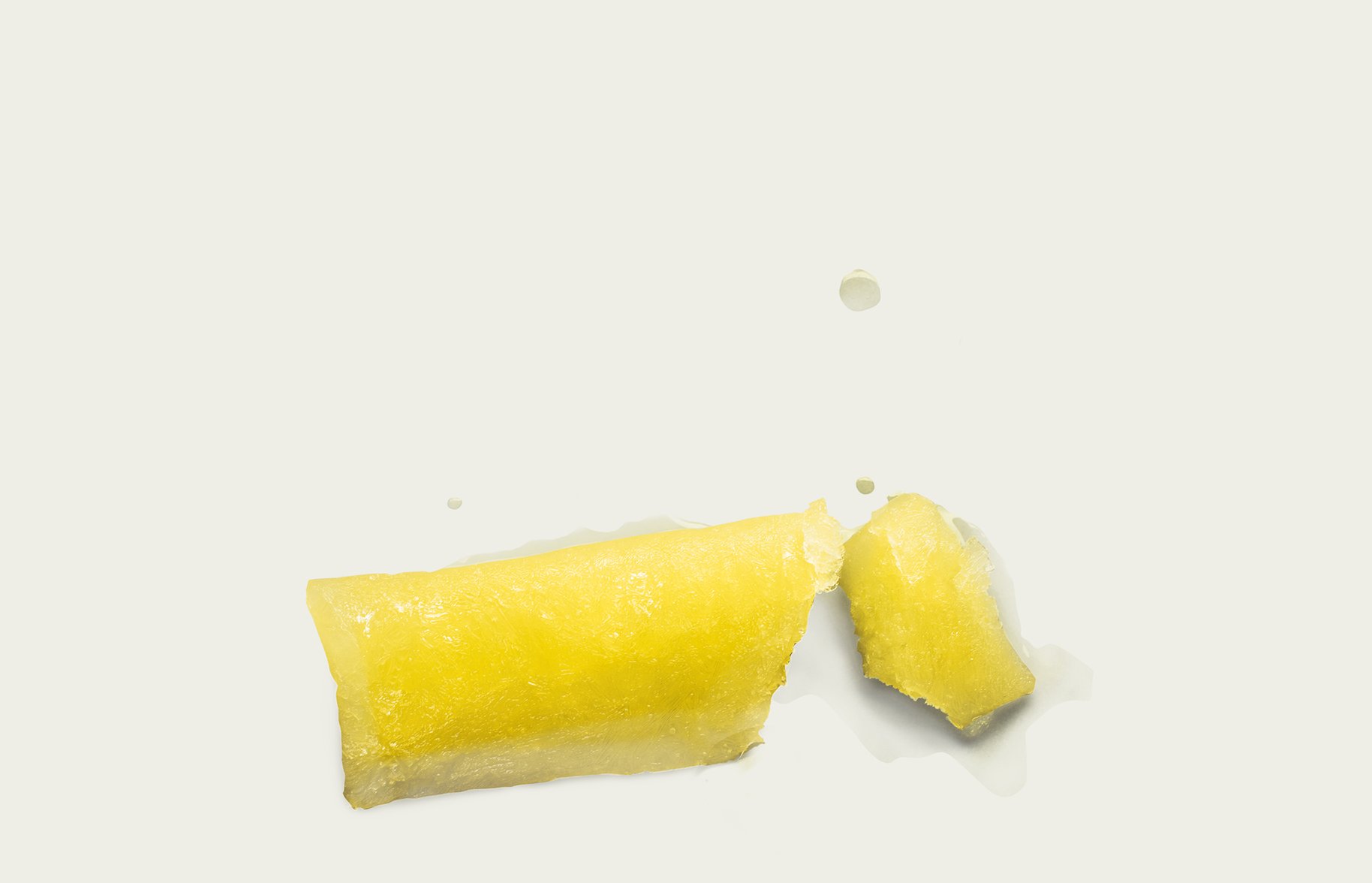
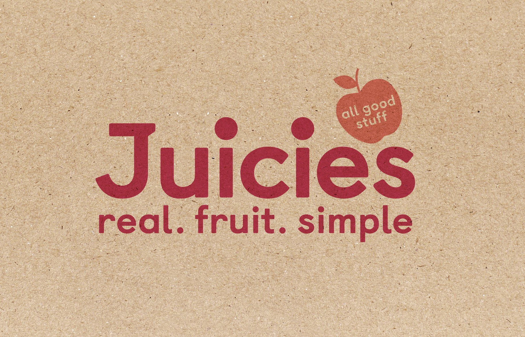
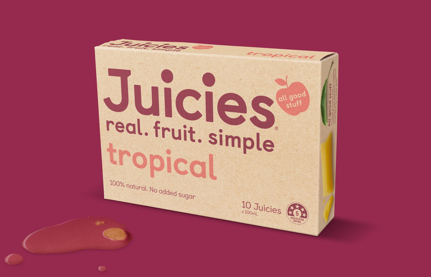
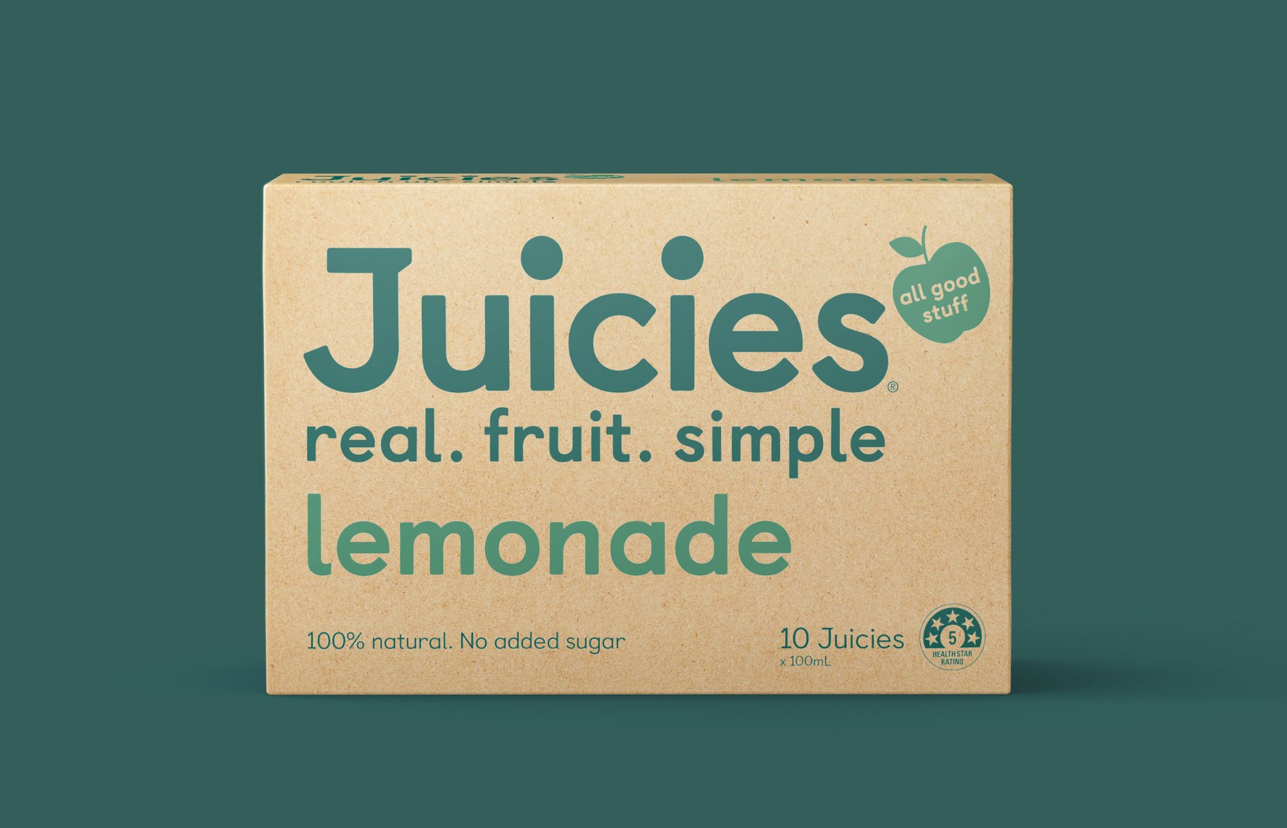
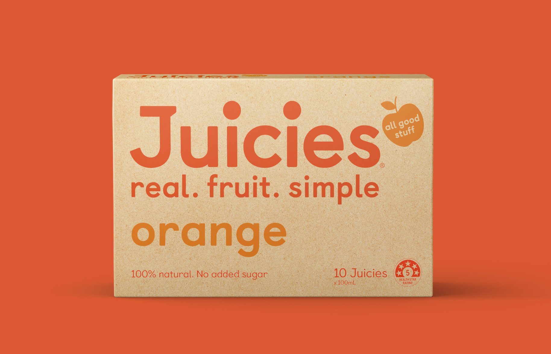
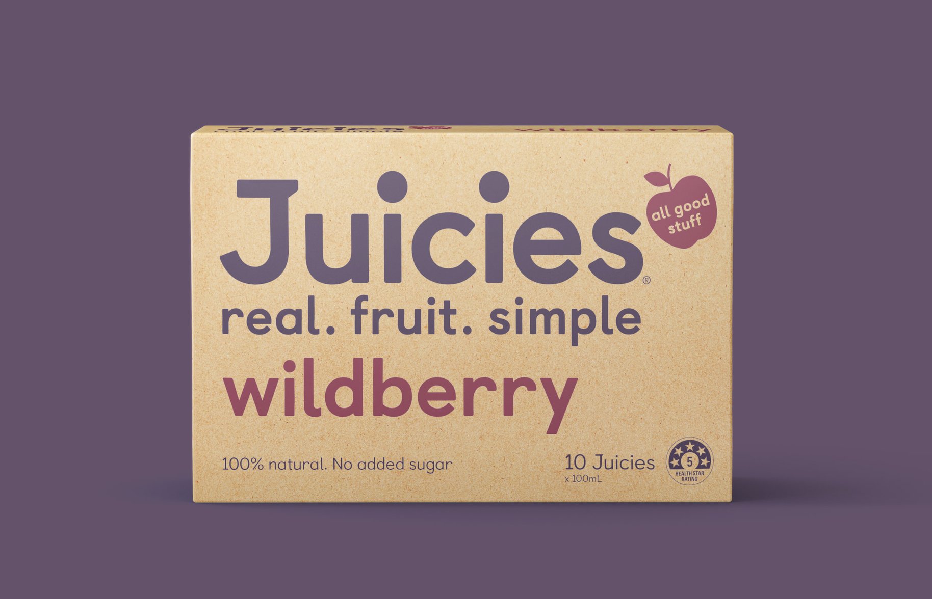
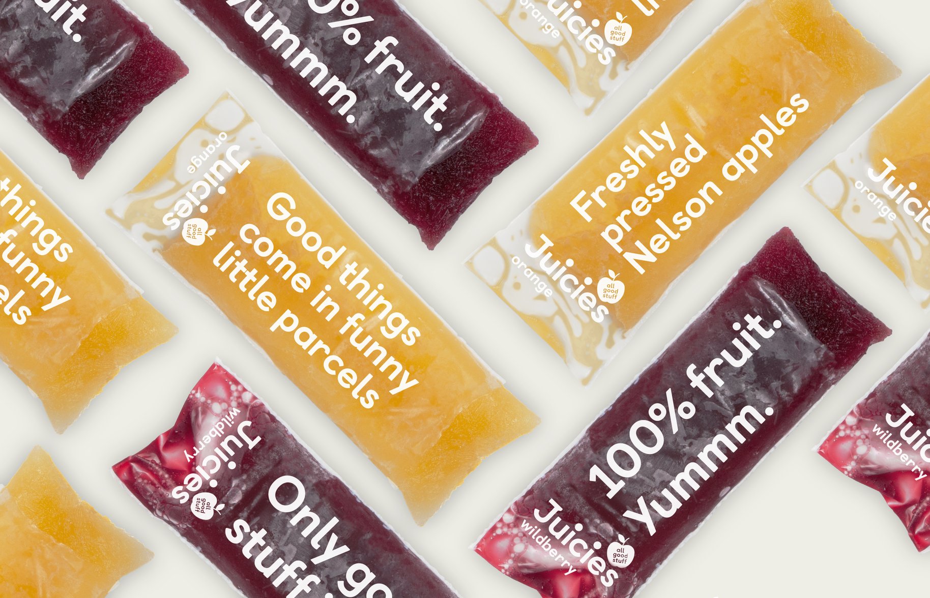
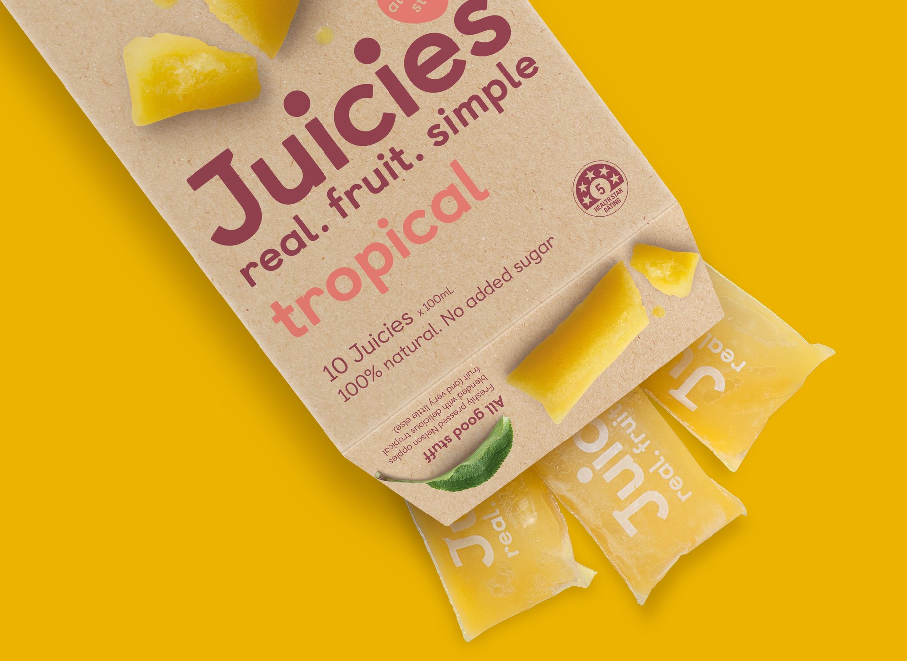
No, not wasabi. But the ancient Japanese philosophy of appreciating beauty in the naturally imperfect. That was kind of what inspired our complete reinvention of Juicies, a brand that many of us had grown up with in school tuck shops. The trouble was that no one kept buying Juicies after they left school. And we put it down to the fact that no one could see how simple and natural and good Juicies really were. In fact, their ingredient list was far simpler than their competitors’. They may not be the most perfectly shaped, and they may have a funny little wrapper, but those very imperfections are part of what make them so appreciated.
- •
- •
- •
- •

"Since launching the updated brand and packaging we have achieved growth in a category that declined by 4%. We have also achieved growth in our school foodservice channels in both New Zealand and Australia and have been able to develop distribution in export markets due to the compelling new look packaging. Juicies has grown up and the new design adds value to the brand by being appealing to not only children and families but also adults seeking healthier, premium ice blocks in export."
Marina Hirst Tristram, Managing Director, Tasman Bay Food Group