Cheers for the beers.
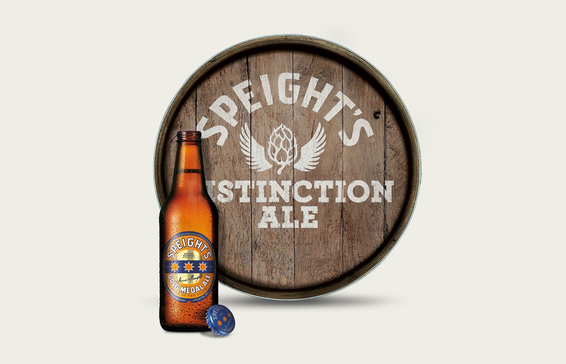
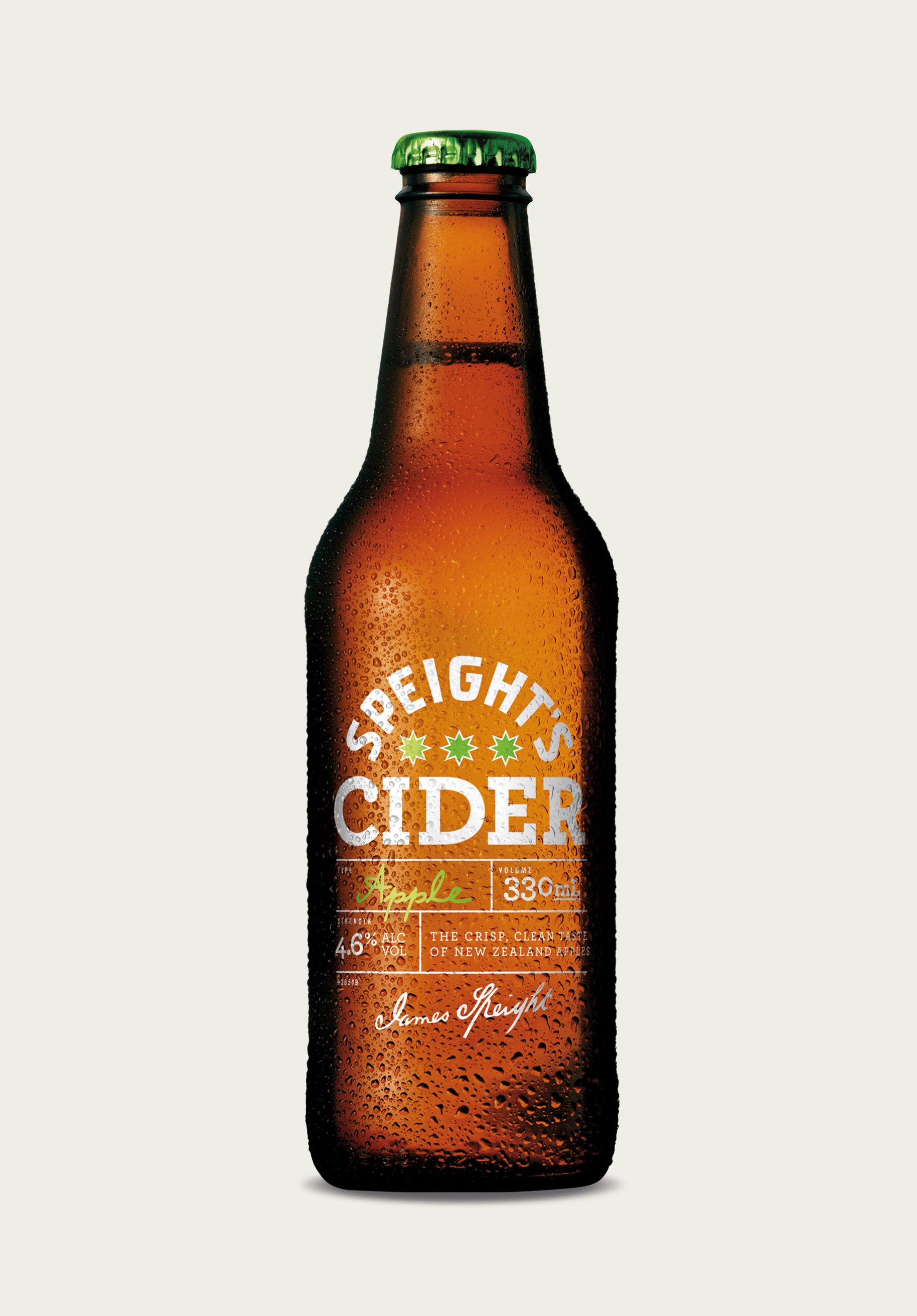
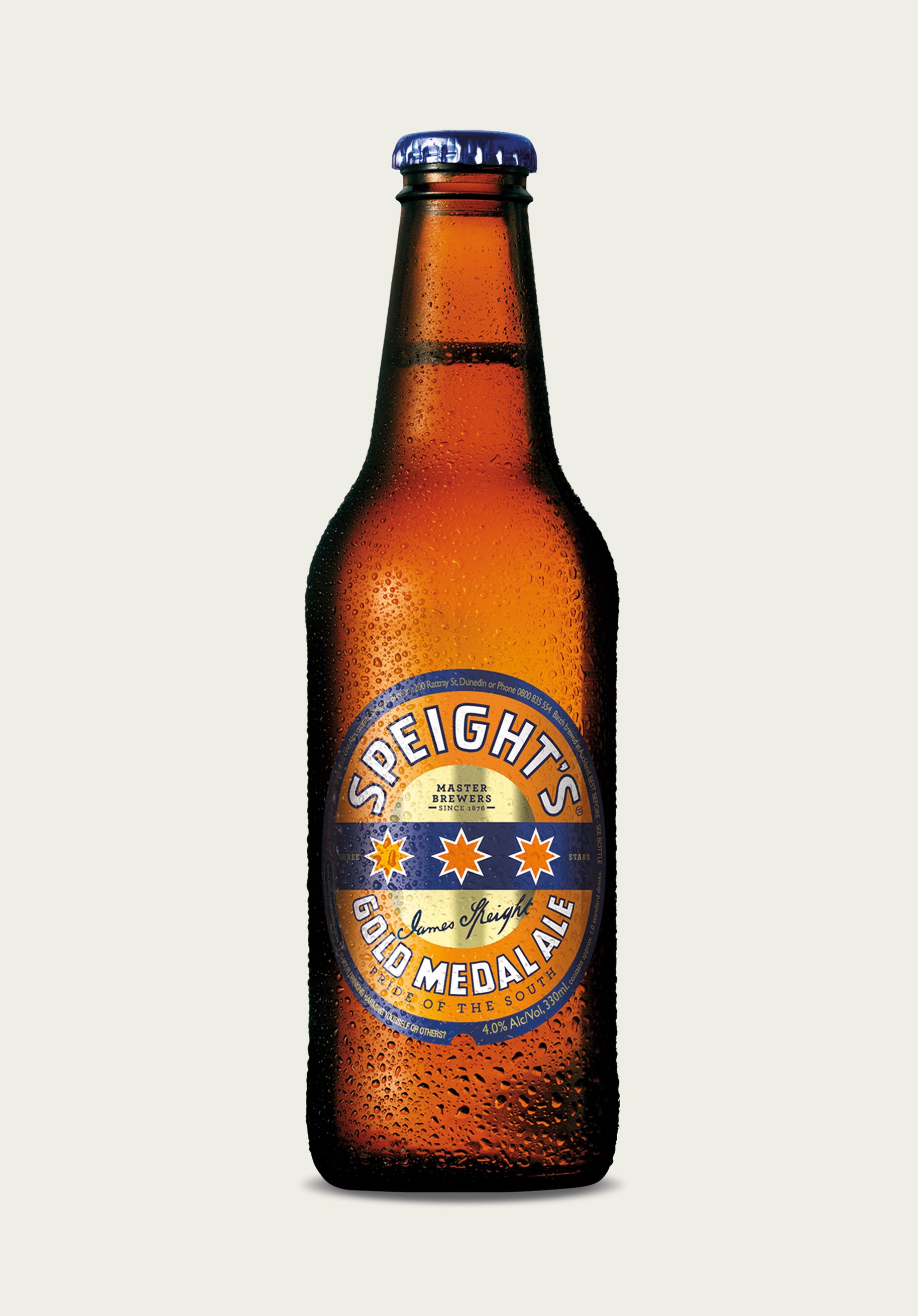
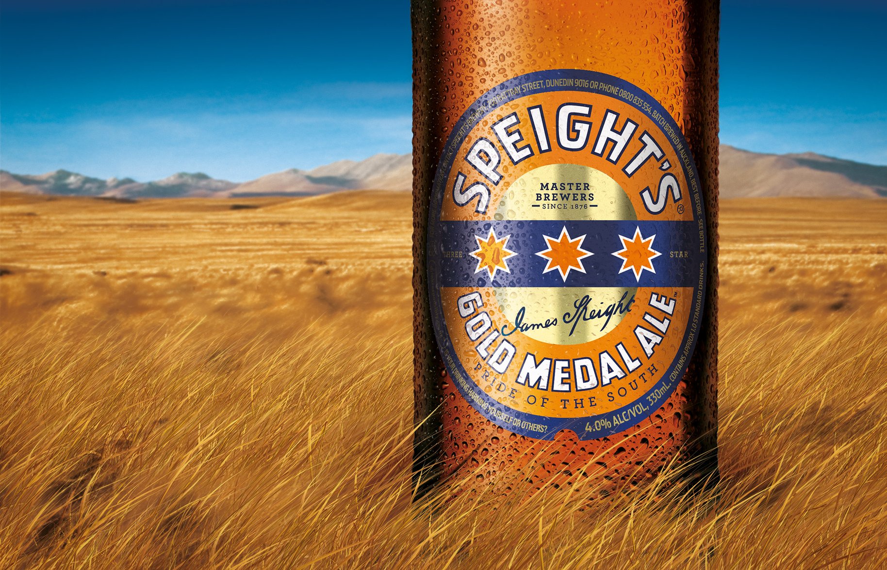
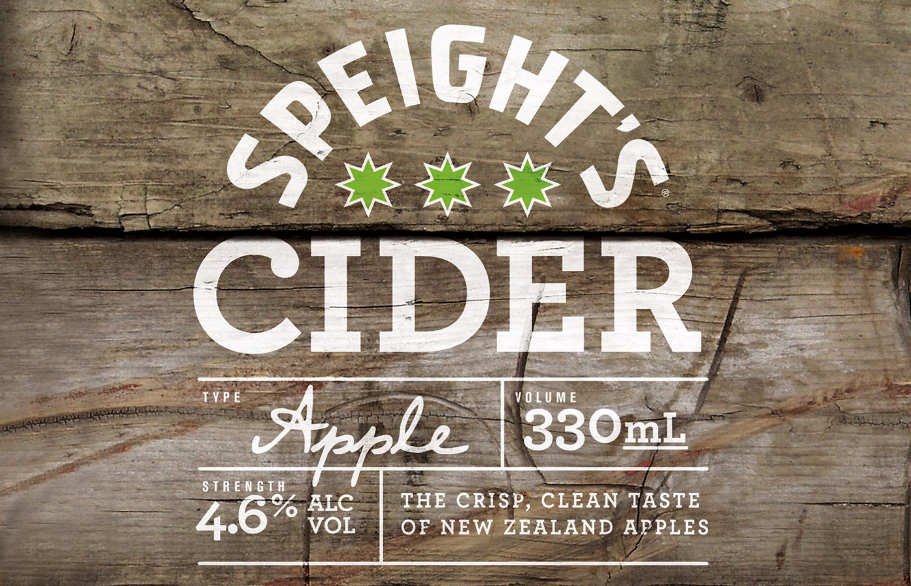
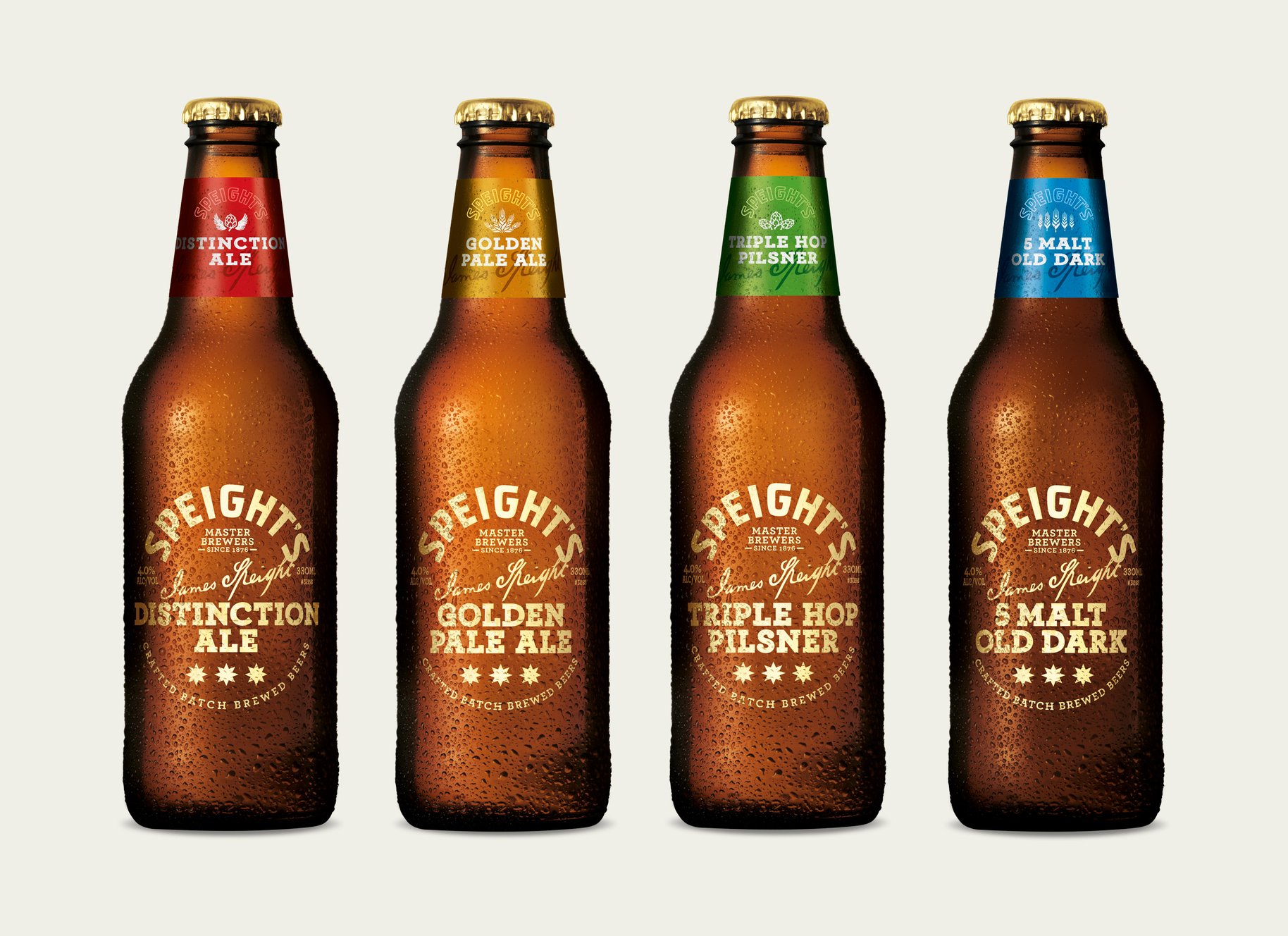
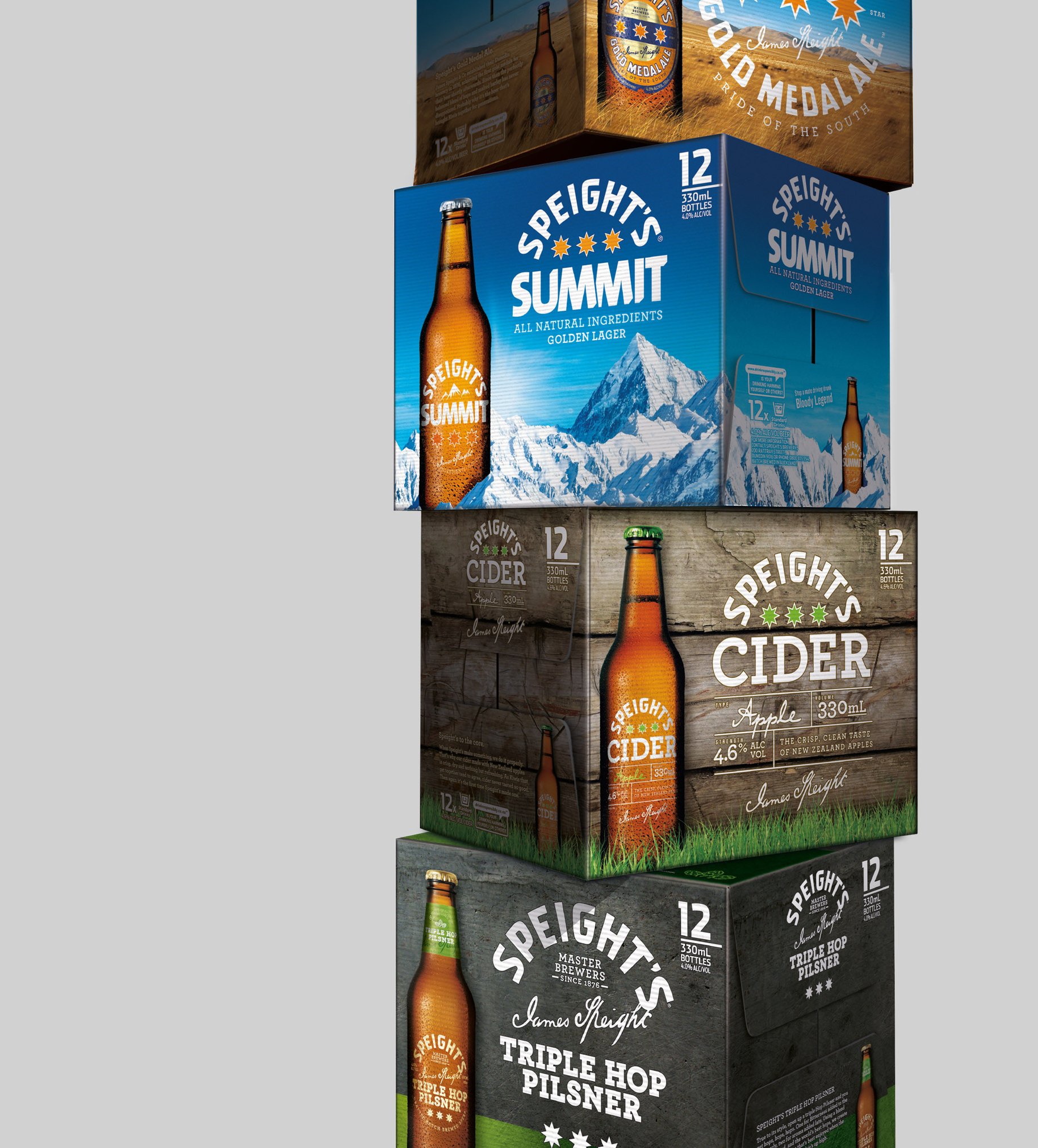
The various members of the Speight’s family were looking little more than distantly related. The venerable Kiwi beer brand had branched out in recent years to appeal not only to the mainstream drinker (Gold Medal Ale), but also the hipsters (Distinction/Cider) and the new age progressives (Summit). Kiwis have loved Speight’s since way back, so the trick was keeping diehard fans happy. Attracting new Speight’s lovers meant reconnecting the dots, then building in subtle differences for different customers. The mantra was evolution not revolution. In design terms, this meant carefully crafting within fonts and other visual elements. Things the customer might only notice subconsciously, but add up to a more modern and appealing looking tipple, which doesn’t happen by accident. It takes skill and expertise. The reward is a chance to enjoy a well-earned beer at the end of it.
- •
- •
- •
- •
- •
- •
“Leading beer sales throughout New Zealand, Speight’s Gold Medal Ale is as popular as ever and we want to ensure it stays that way”
— Jonte Goldwater. Marketing Manager, Lion Breweries.