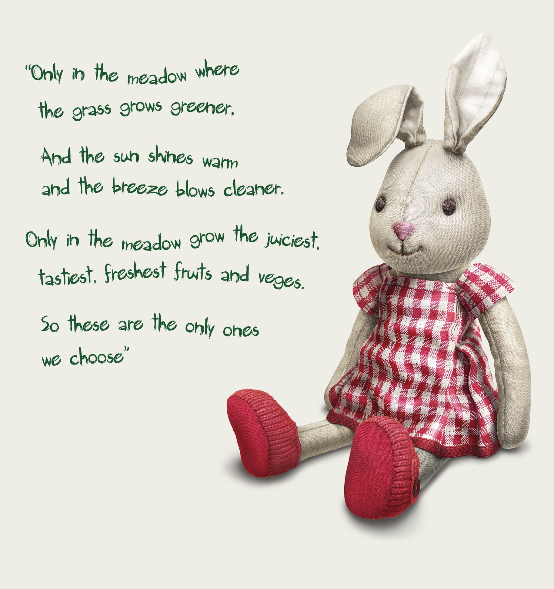
The grass is greener where you water it.
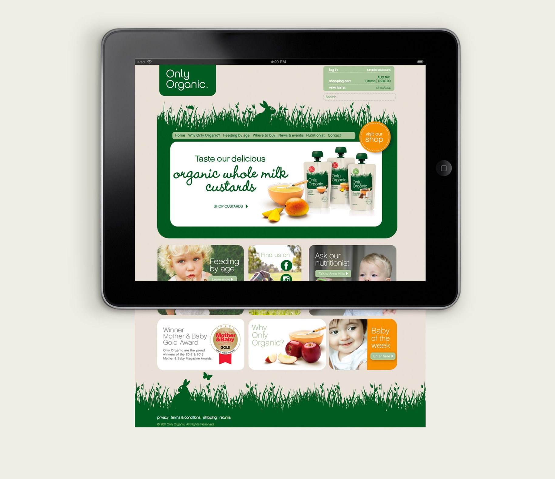
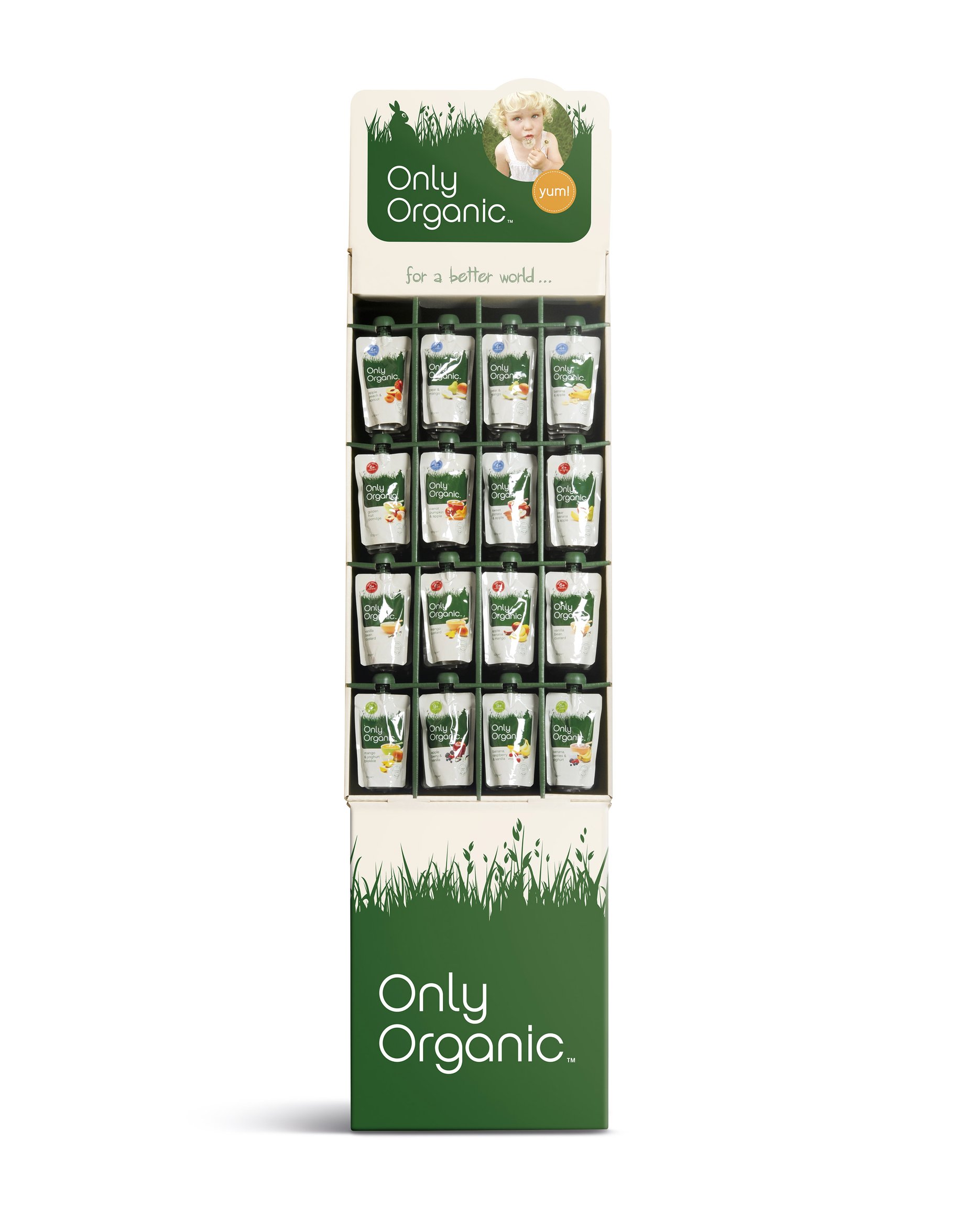
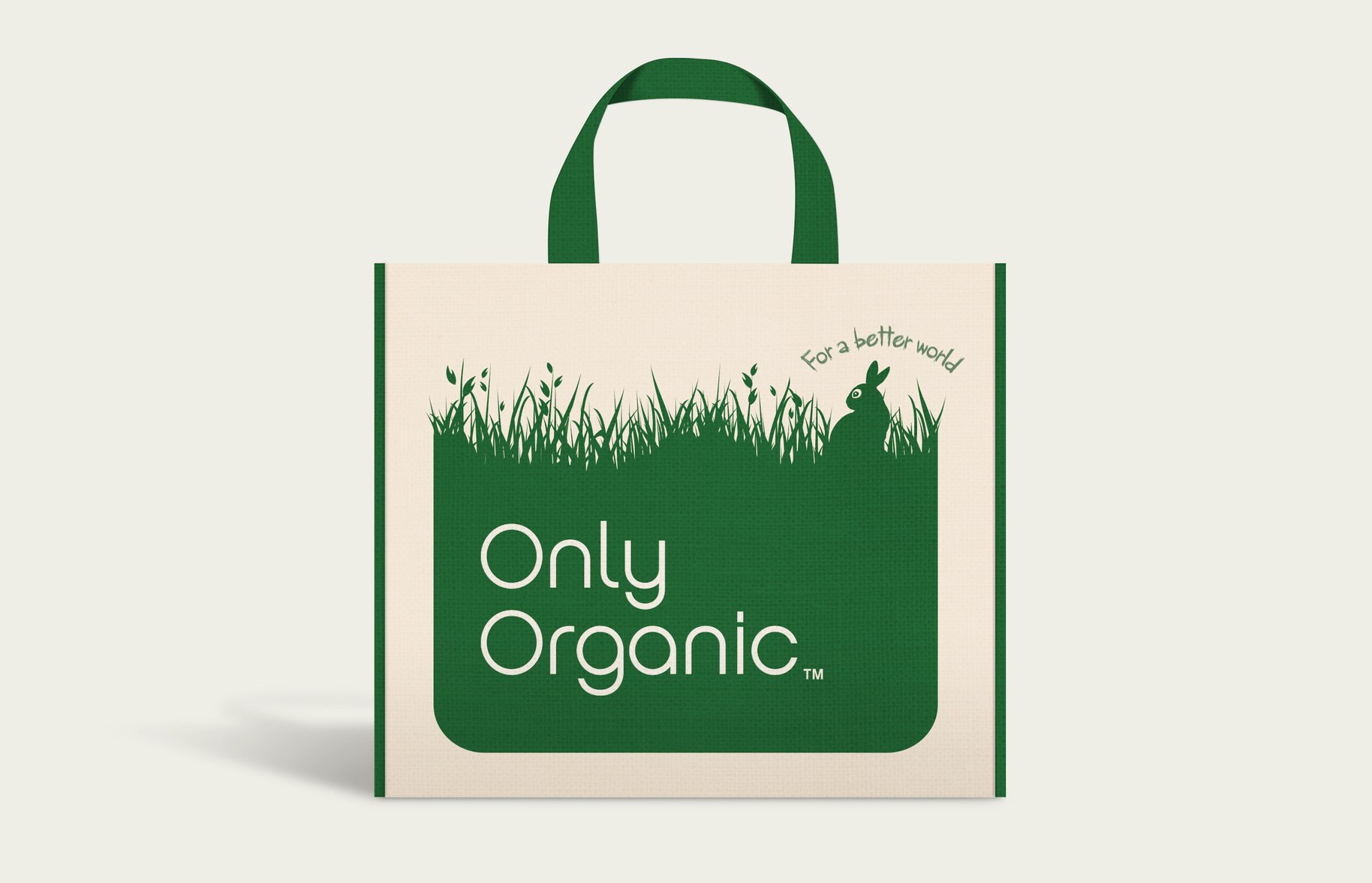
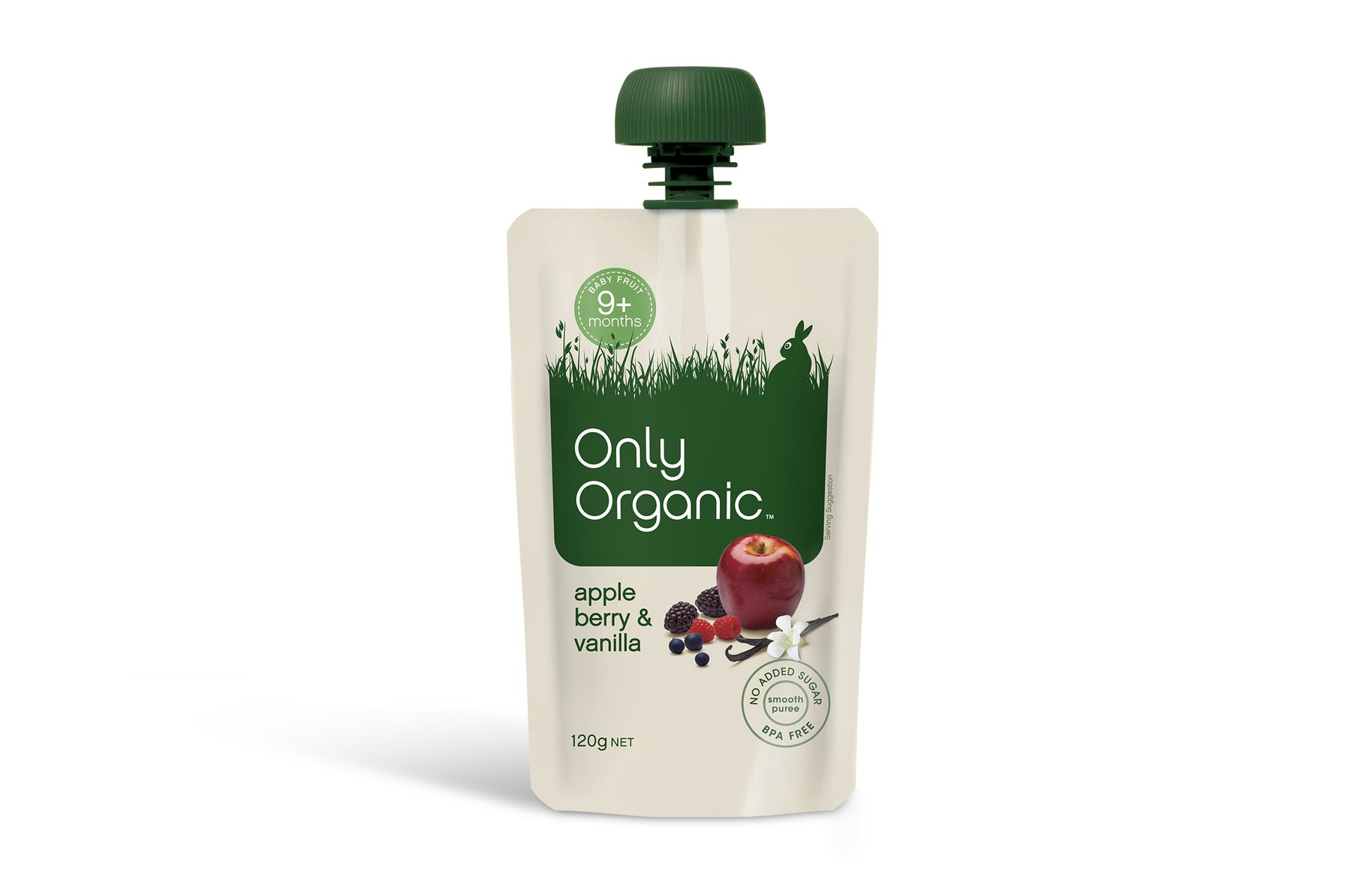
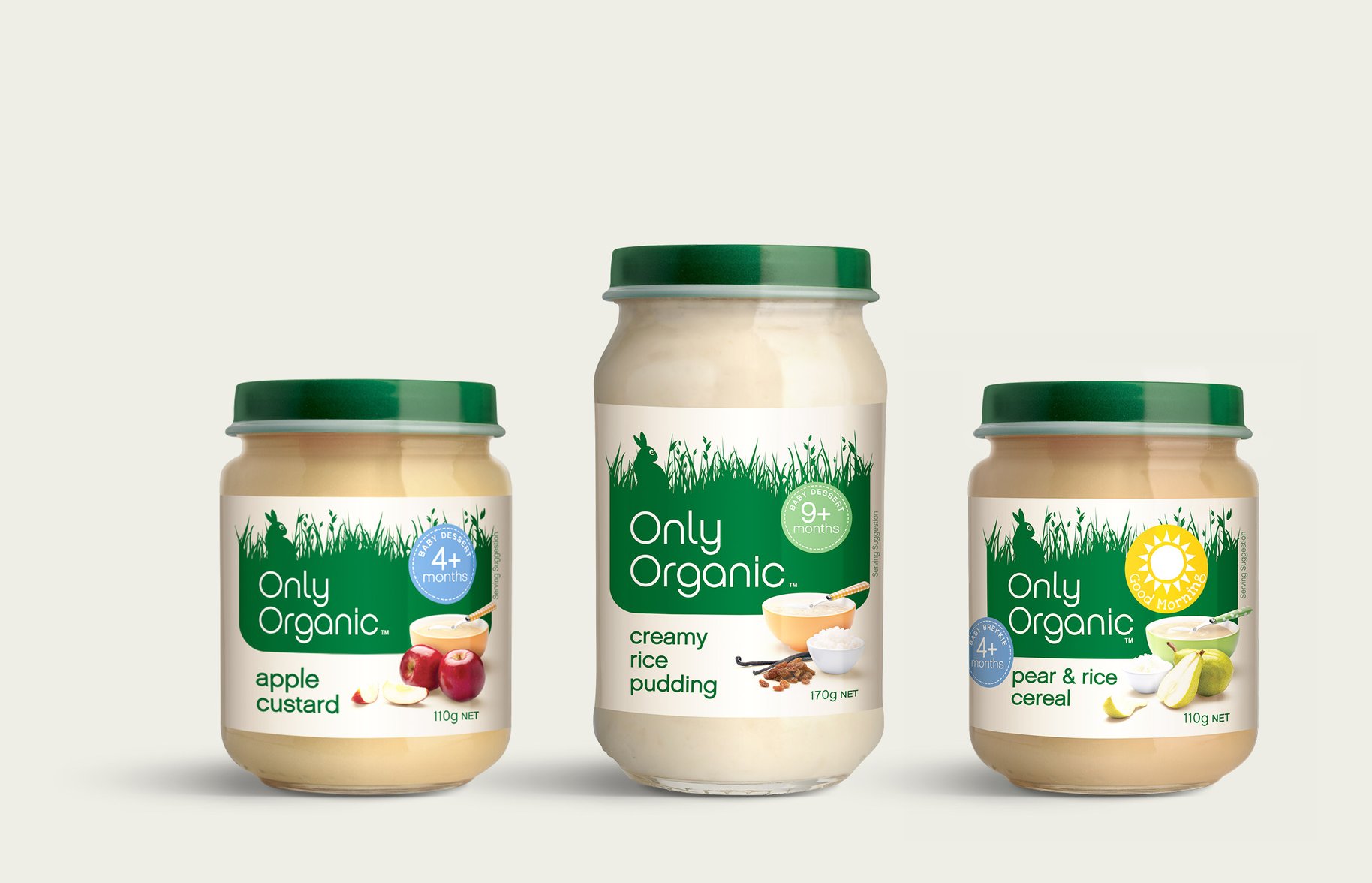
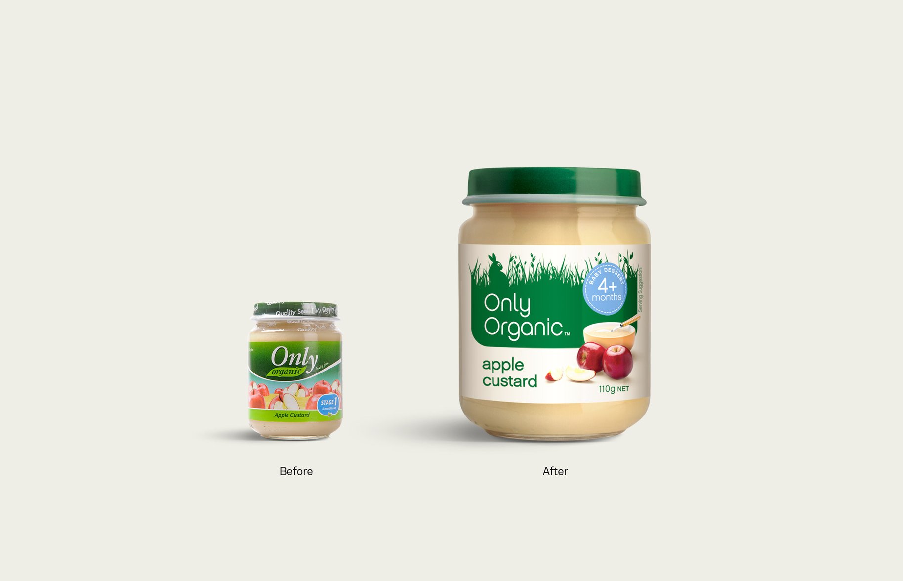
Around for ten years, Only Organic felt anything but – its tired, eighties look needed to enter the 21st Century. And a previous rebrand just wasn’t working. So Only Organic came to us to set things right. Fixing things meant more than just redesigning the labels. It was about finding a fresh and aspirational way to talk to mums. We believe ‘organic’ doesn’t have to mean bad design. Only Organic needed to reflect this modern organic lifestyle. One that cares for mums, babies and the environment. Given the rise of the ‘mommy blogger’, the design also had to live both online and in the real world. We saw from our outside-in approach that other baby food makers weren’t connecting emotionally with mums. So, we did just that – with soft, warm colours, and simple, fresh typography. Against the background of a green meadow, sat clear information to help busy shoppers. A far cry from its previous predictable and corporate look. By looking beyond the pack to the modern mum’s world, we made the story more than a product – an organic lifestyle.

- •
- •
- •