Hand in hand.
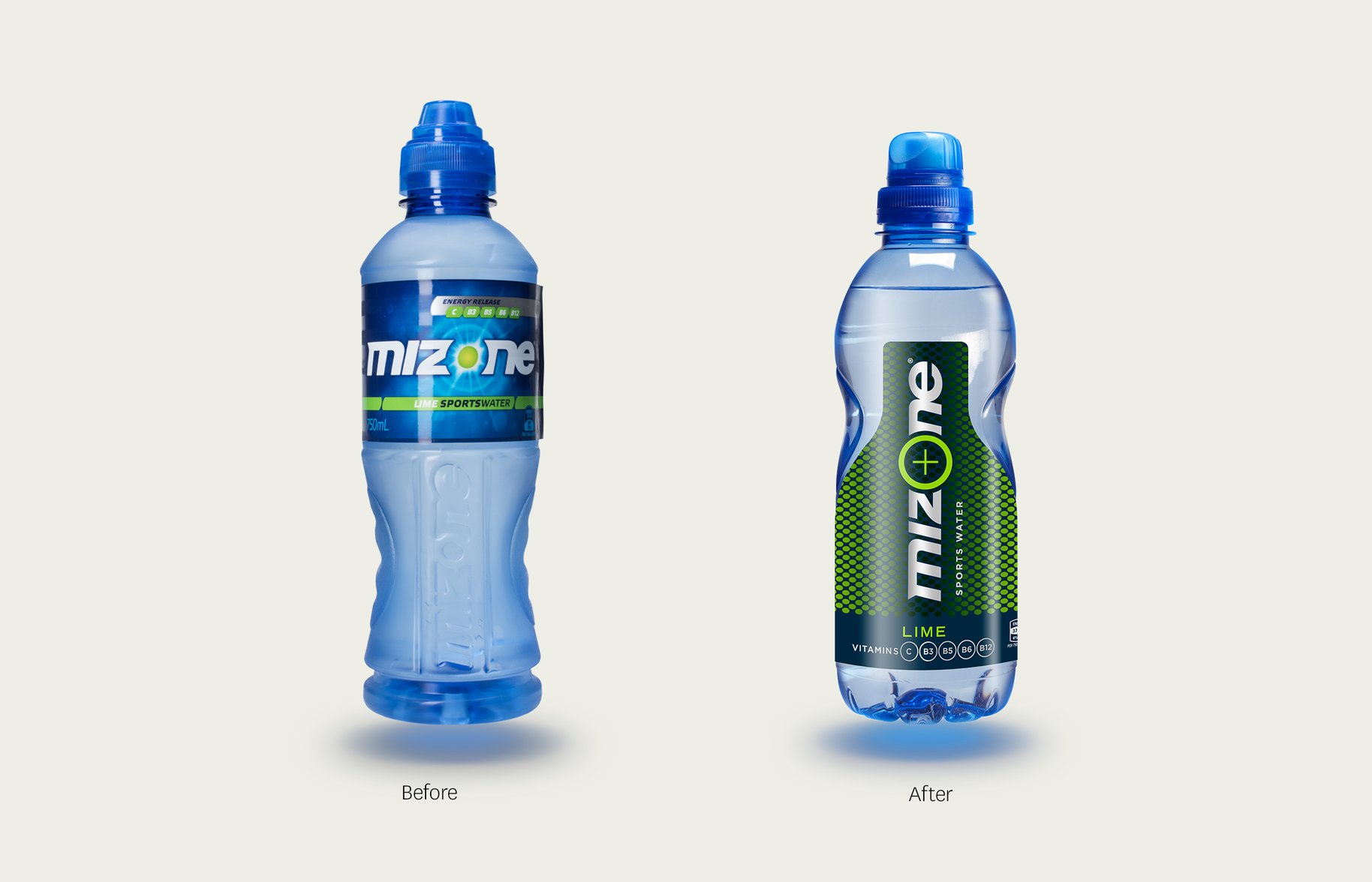
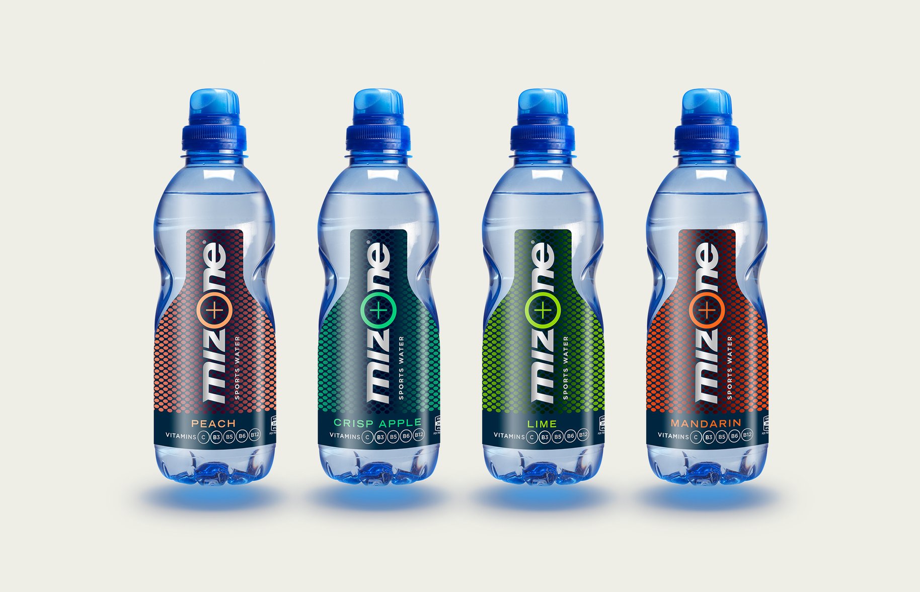
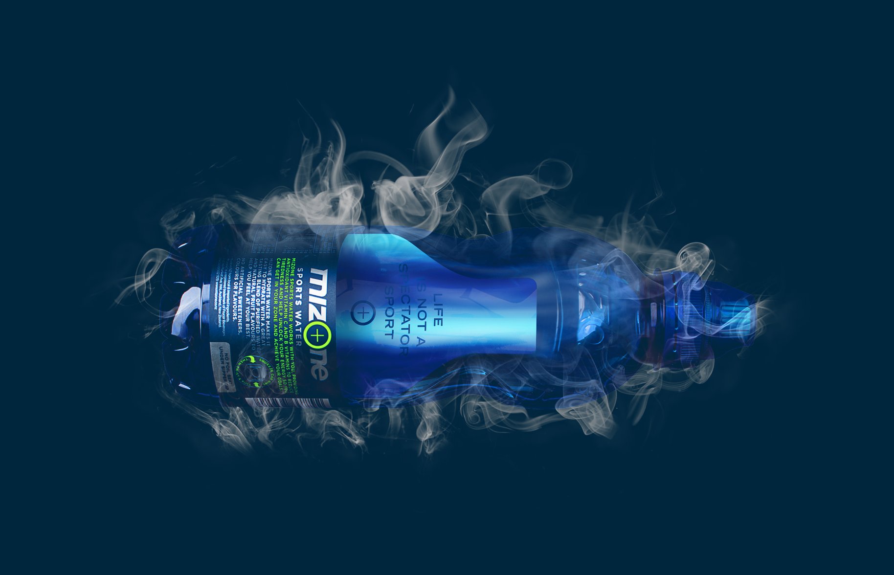
This was a special project for us, because unusually, we got to design the container as well as the brand – hand in hand, which is pretty much like being blessed by the Dalai Lama and winning Lotto on the same day in the design world. And, funnily enough, has resulted in a significant hand-out for the brand too. From the moment the hand slips into the new, deliberately higher-placed ergodynamic grip, there’s a feeling of at-one-ness. But then again, you might just be seduced by the matte-metallic mesh which is pretty damn handsome all by itself.

- •
- •